DASHBOARD DIAGNOSTICS
UsabilityHub—a renowned remote user research platform—wanted to evaluate its internal-facing administrative dashboard. My team provided a research plan to identify causes of frustration and prioritize recommendations for improvements.
As part of a three-person research team, I conducted usability interviews to uncover the causes of employee frustration around the dashboard and related workflows. Insights indicated inefficiencies in work processes and missing functionality that would lead to a better experience. I also designed simple mock-ups to visualize potential solutions. Our findings were immediately put into action by the team responsible with a reskin being developed over the course of a couple weeks. This project was a learning collaboration as part of CuriosityTank’s Ask Like A Pro Certificate Program.
Client
UsabillityHub (Now Lyssna)
May – July 2021
Contributions
Co-authored research plan
Employee interviews
Synthesis
Topline report and highlight reel
Team
Samuel Bendriem
Naz Gilliland
Rob Rausch
At A Glance
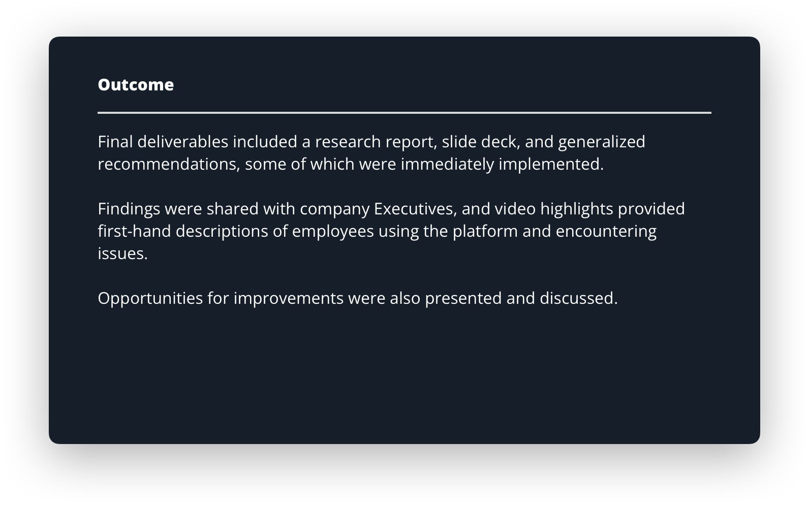
“The most unloved tool in UsabilityHub’s domain.”
As the portal to all back-end business and management needs, the UsabilityHub dashboard is integral to employee efficiency and satisfaction. Ongoing internal complaints prompted the company to seek a deeper understanding of its dashboard’s shortcomings, evaluate causes of frustration, and prioritize improvements.
Business Goals
- Reduce payout time for panelists.
- Reduce training time through a more intuitive interface.
- Reduce the amount of manual data entry.
- Decrease employee frustration and formally capture feedback.
Research Goals
- Understand the task landscape for administrative teams.
- Identify user pain points through task evaluations.
- Provide recommendations for prioritization.
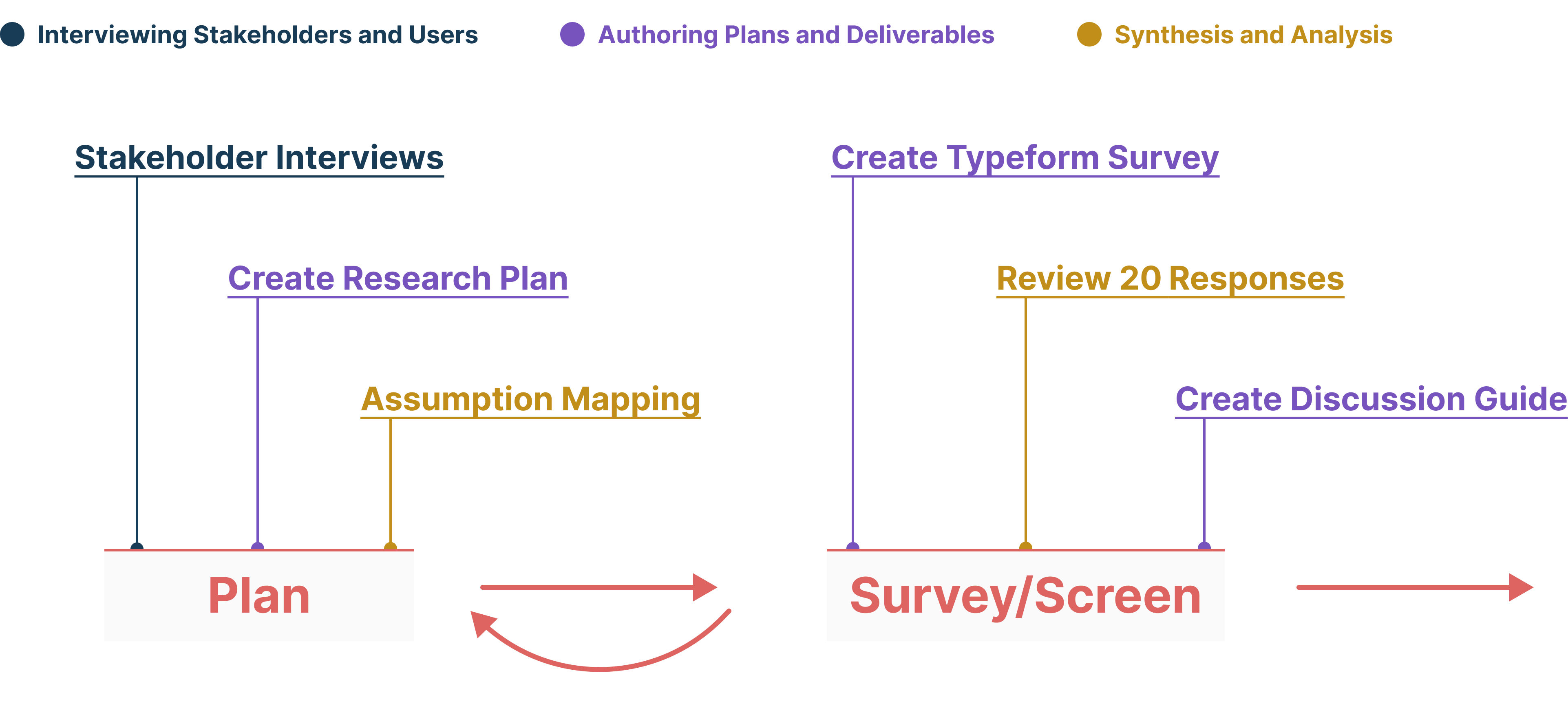
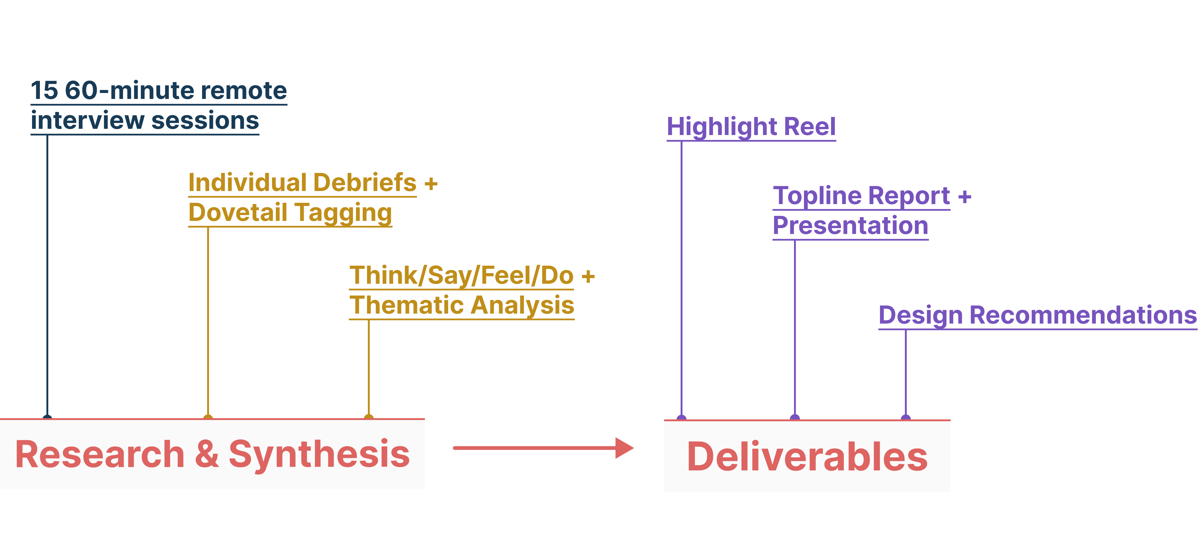
Fig. 1: The approach to the problem and solution space: Planning the research; conducting surveys, interviews, and synthesis; and delivering a highlight reel and topline report.
Survey + Screen
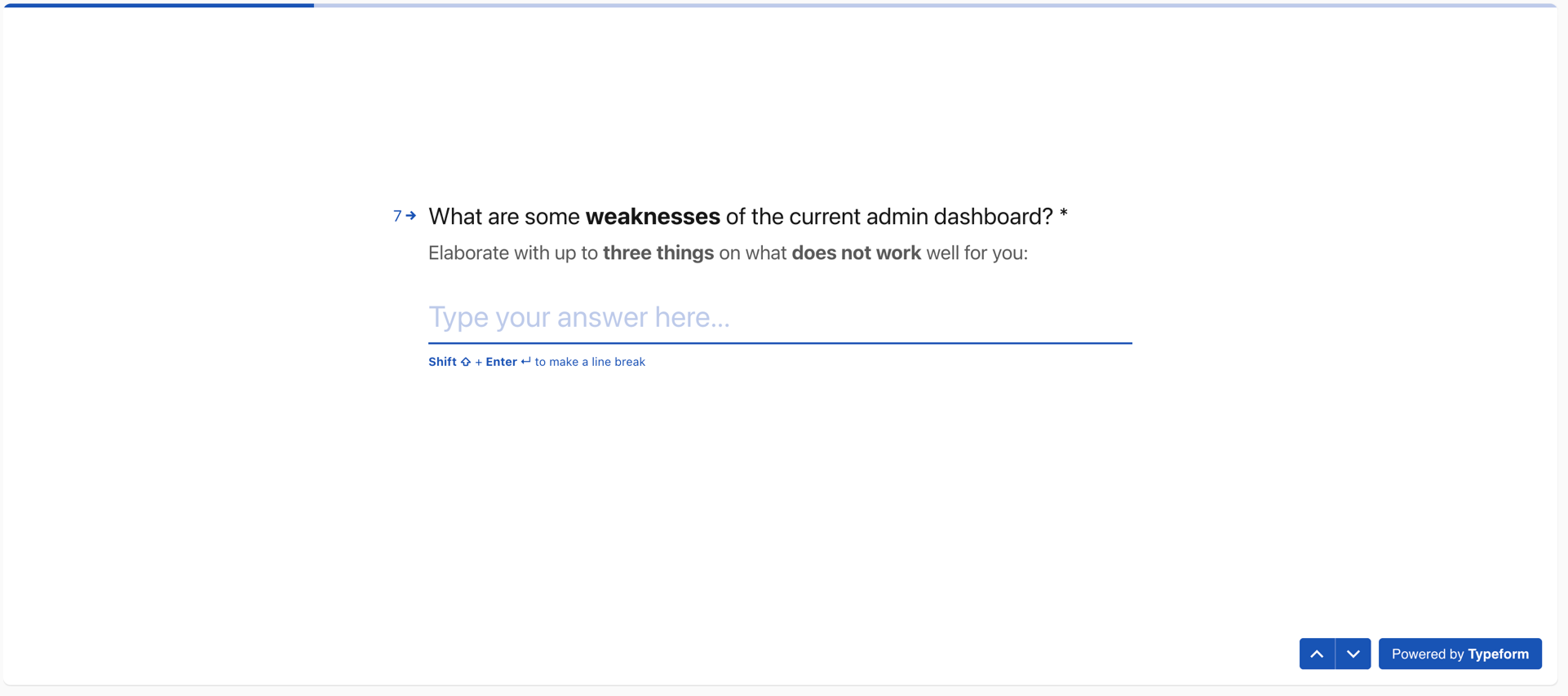
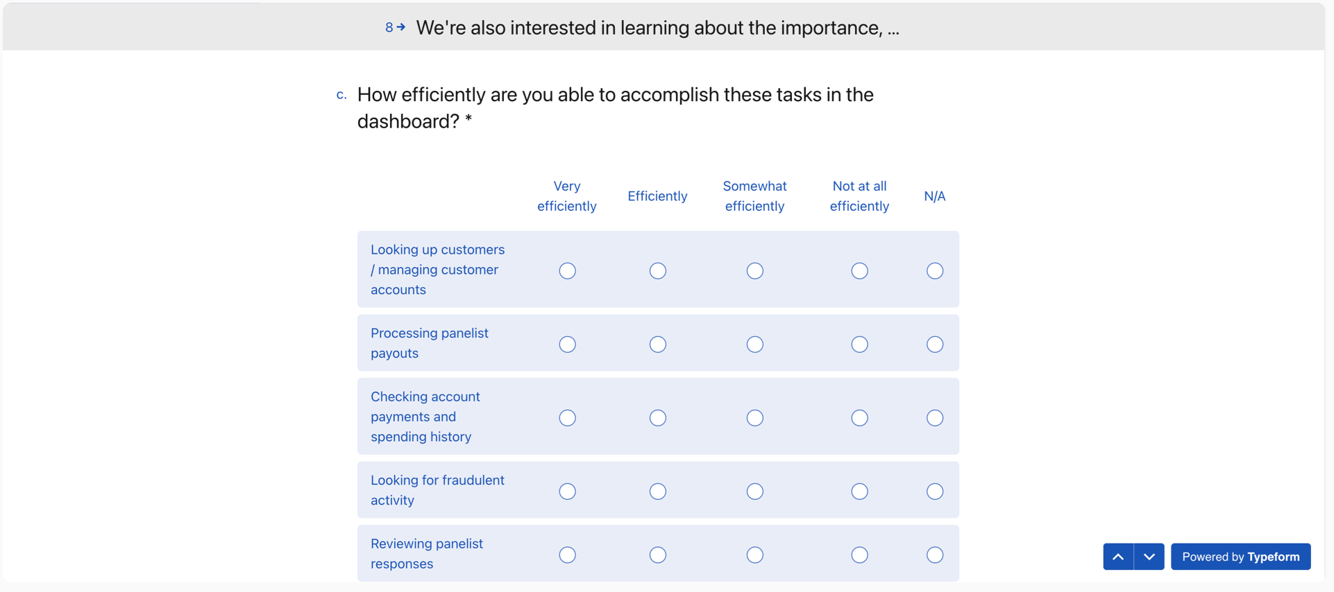
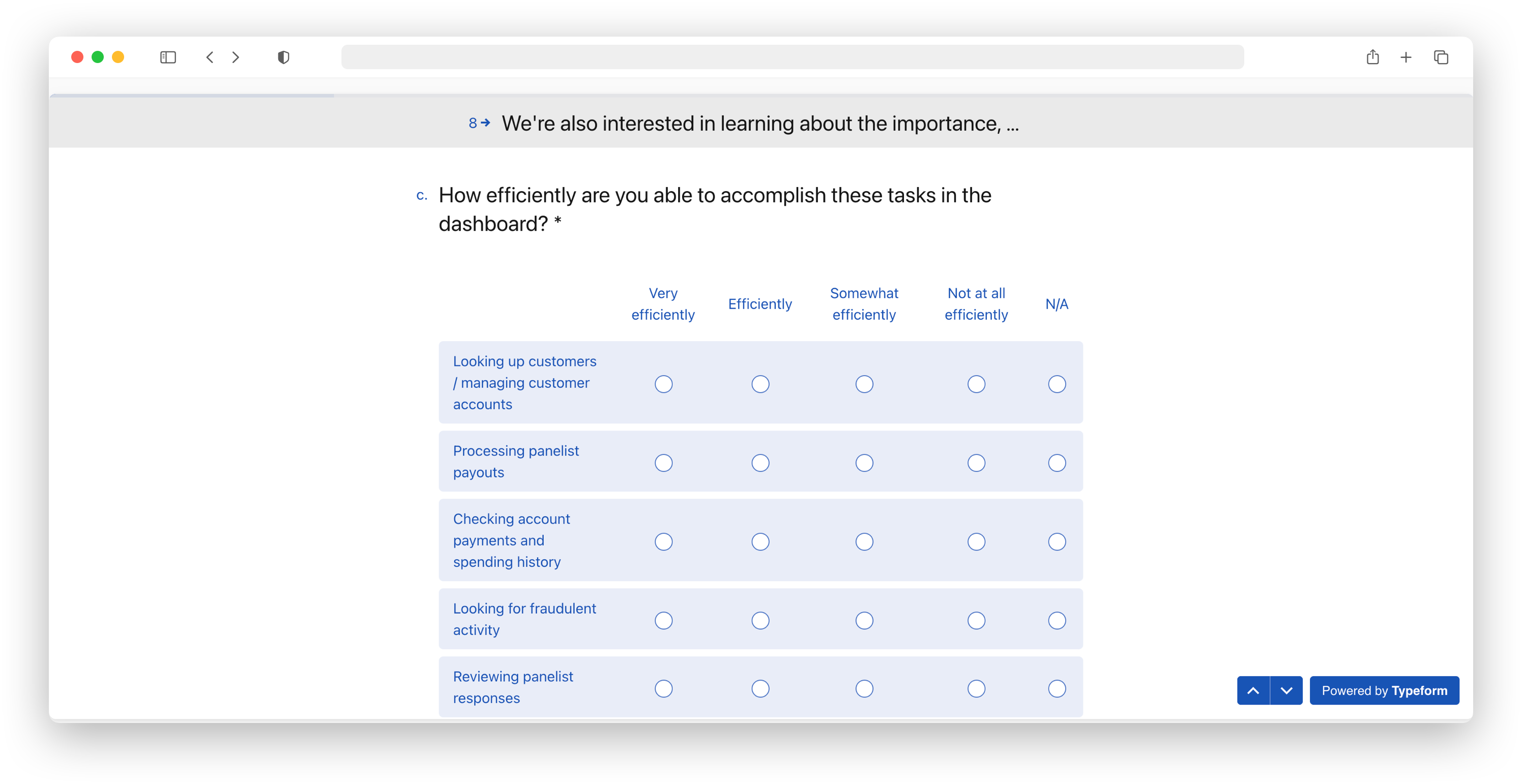
Fig. 2: Survey questions via Typeform.
Understanding the task landscape and satisfaction of use.
We surveyed UsabilityHub employees to understand their tasks and learn about the perceived strengths and weaknesses of the dashboard. Participants were asked to rate the tasks they complete on the dashboard, in terms of: “How important is each task to completing your job responsibilities?”, “How frequently do you complete each task?” and, “How efficiently are you able to accomplish each task in the dashboard?”
Survey Results
Our results indicate that, while the dashboard functions adequately as a platform, it falls short in providing an enhanced employee experience, specifically regarding its ability to surface information and search customer records, as well as its overall usability as a business tool.
Surfacing Information
+ Surfaces important information about customer accounts, orders, panelists, payouts, etc.
– Not all information is easily accessible, linked, or presented consistently.
Usability
+ Intuitive, basic, easy-to-navigate once you’re familiar with it.
– Sales and financial activities are done 100% manually.
Searching
+ Search functionality allows searching by partial name and email address.
– Inability to search by account type, account number, test number, or within notes.
Usability Interviews
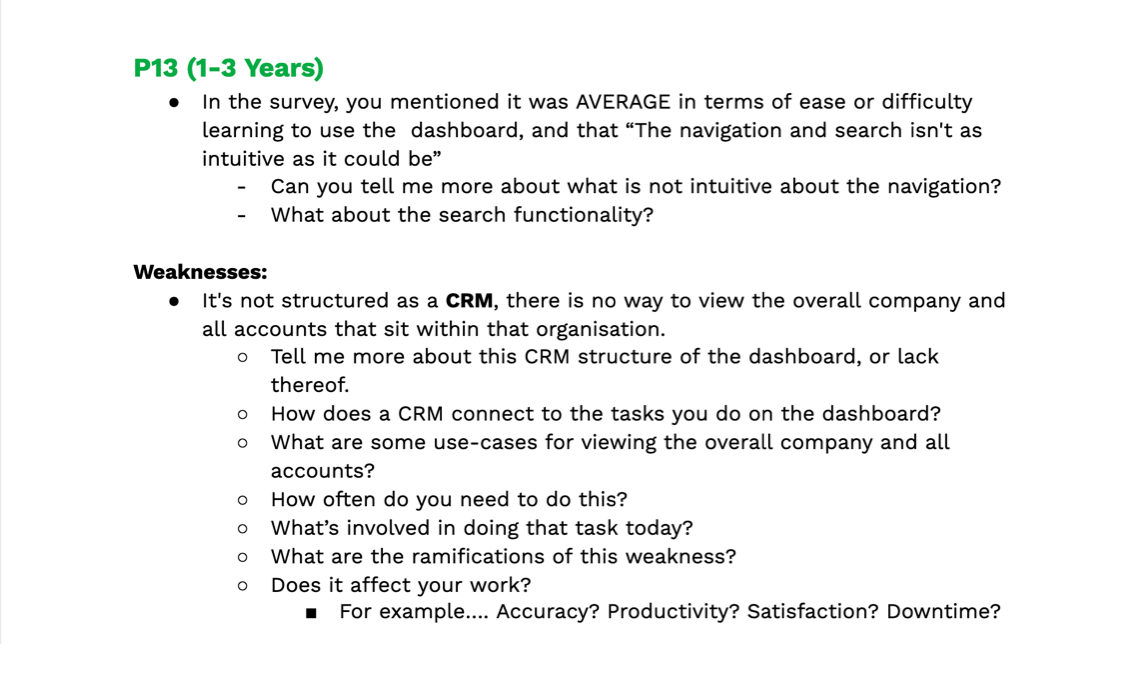
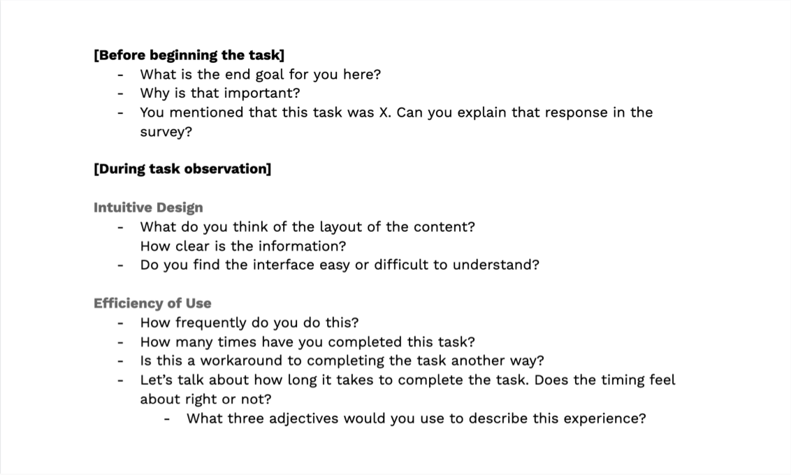
Fig. 3: My team developed a discussion guide to provide consistency across interviews. In each interview, we covered common themes: roadblocks to completing tasks and workarounds; heuristic elements such as usability, aesthetics, and error severity; and descriptive phrases summarizing employees’ experiences.
Identifying usability pain-points and friction.
With a clearer understanding of the UsabilityHub task landscape, as well as overarching areas of the dashboard to focus on, we conducted 60-minute interviews with 15 available participants across all 6 teams to contextually understand user responsibilities, dashboard perceptions, and workflows. I was assigned 5 employees to interview one-on-one.
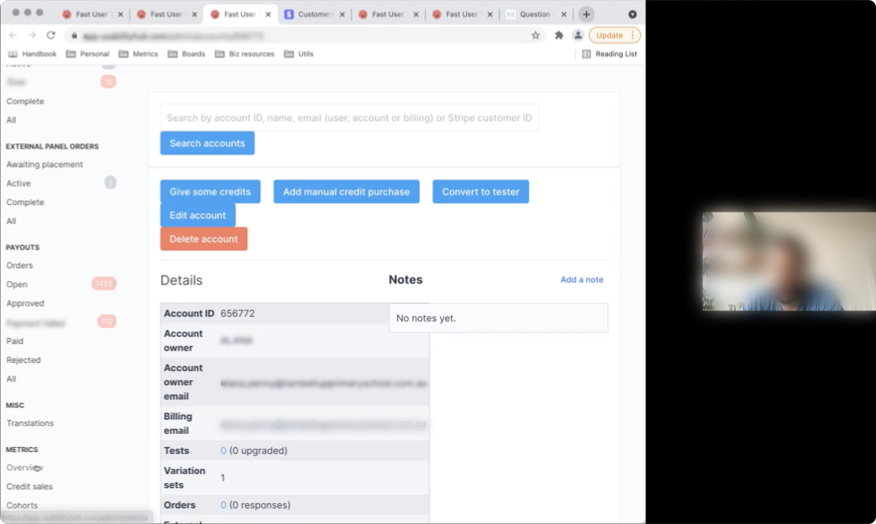
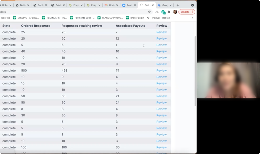
Fig. 4: Screenshots from 60-minute usability interviews with UsabilityHub employees and stakeholders.
Synthesis
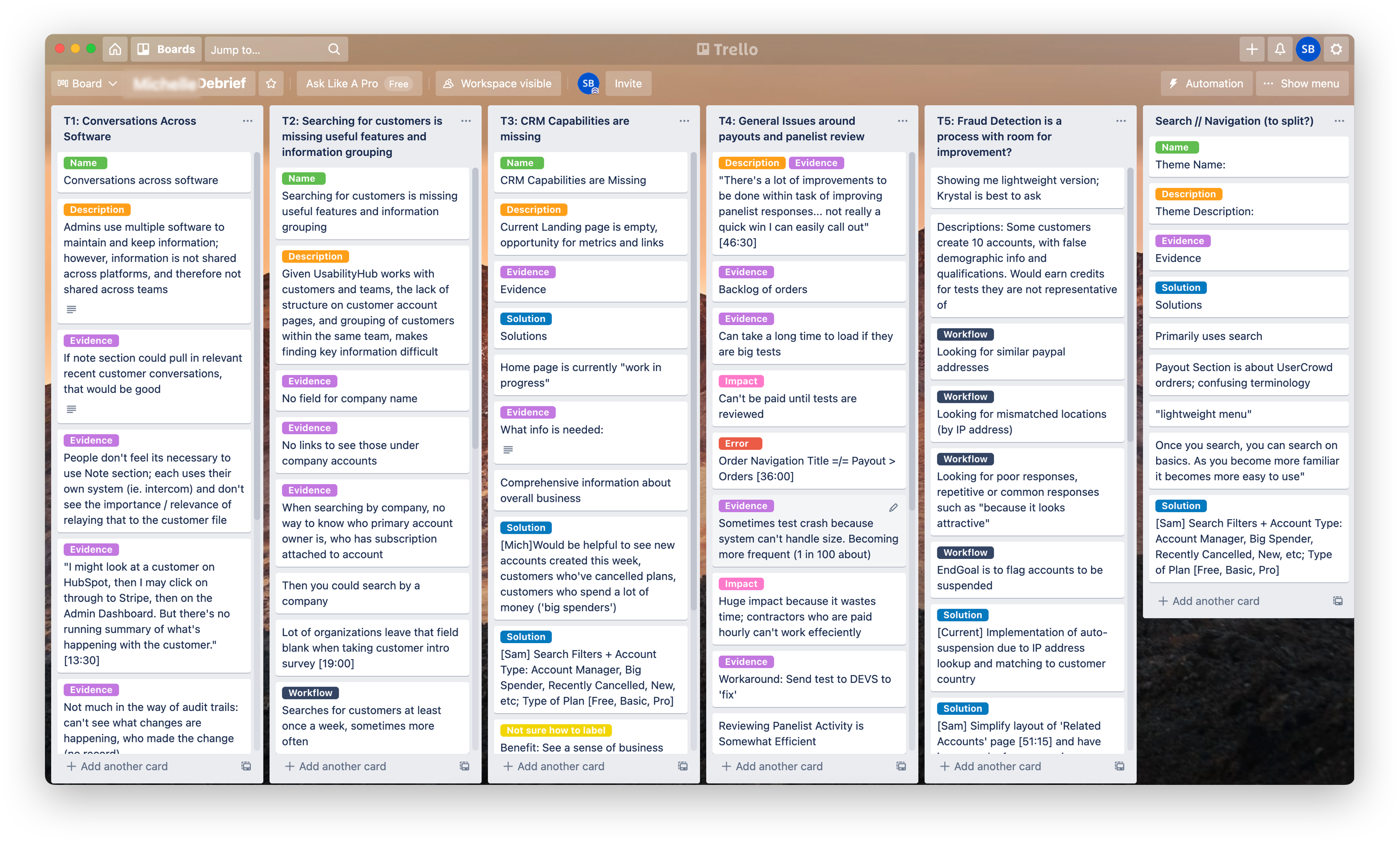
Following the interviews, I analyzed and synthesized the data from my 5 participants. I used Trello for initial debriefs and thematic categorization, then used DoveTail to transcribe the interviews and tag pain points, issues, and opportunities.
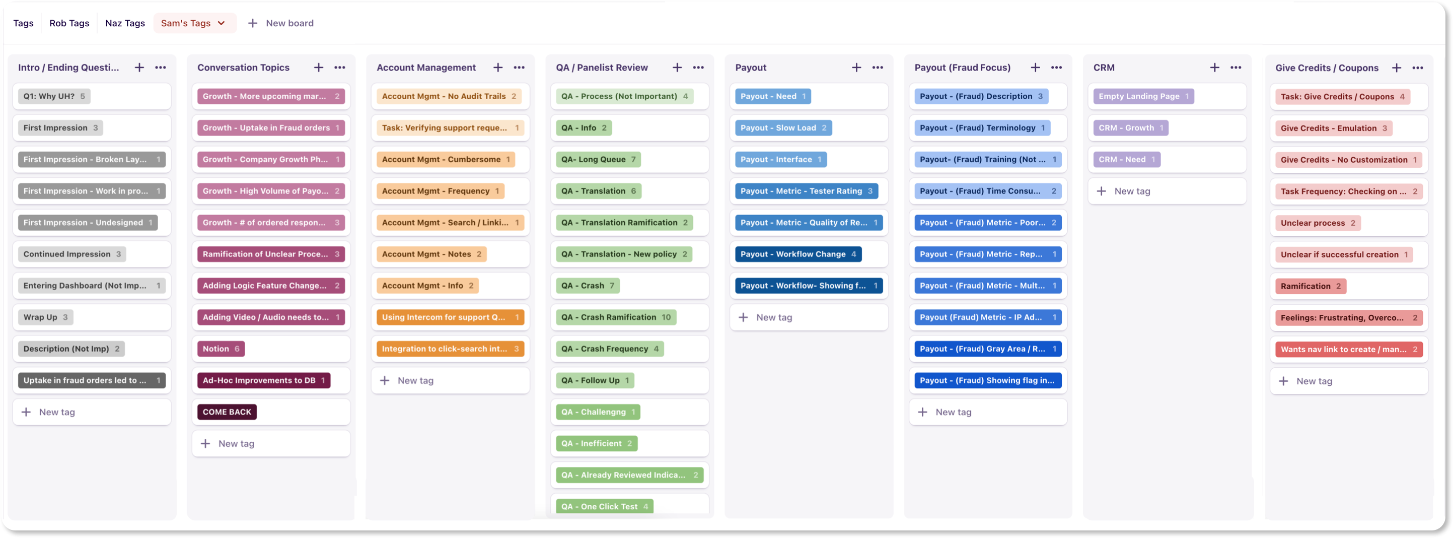
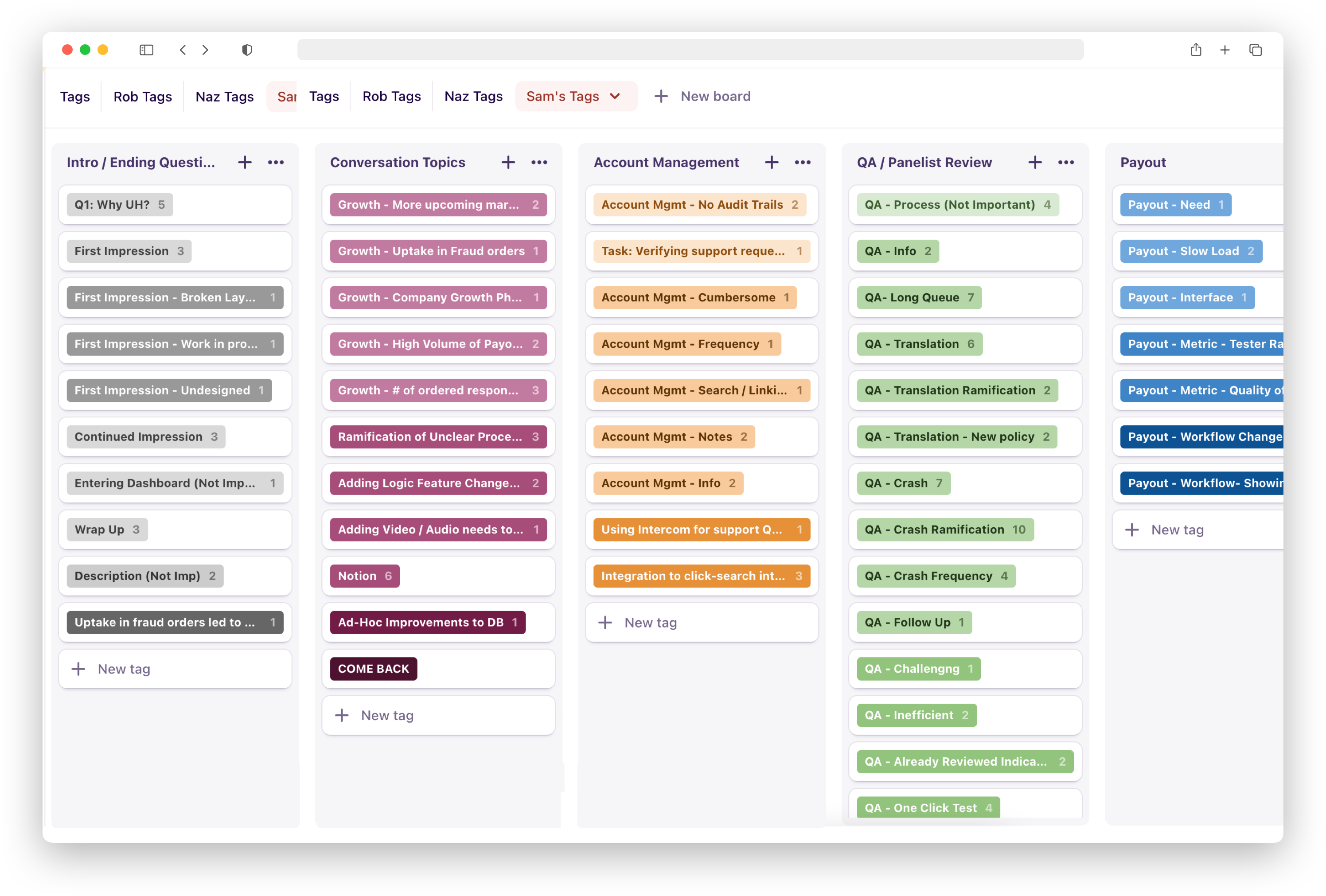
Fig. 5: Tag management in Dovetail.
Insights and Themes
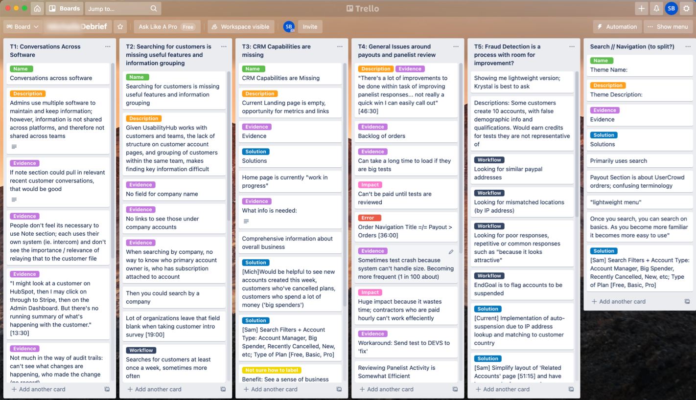
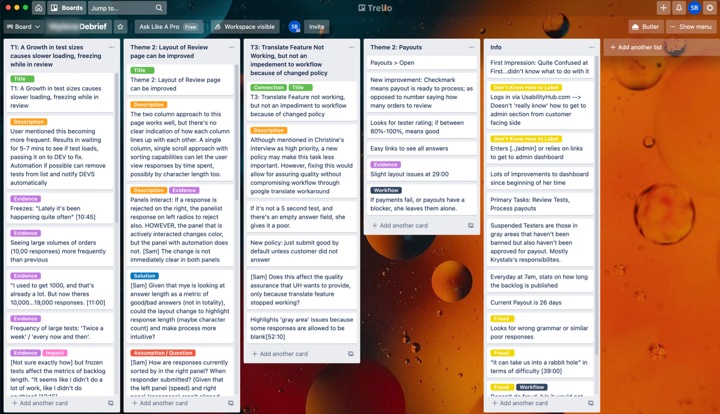
Fig. 6: Sample post-interview debriefs in Trello with general themes, evidence, and impact.
“Time consuming and repetitive.”
Overall, our findings indicated general themes revolving around workflows, features, design and integrations, which all hinder the employee experience.
Design Considerations

Fig. 7: Design consideration regarding sorting responses to reduce cognitive load.
Addressing Usability Issues
These primarily focus on tasks handled by the Quality Assurance team, who must review responses before panelists are paid. Time-consuming tasks made reviewing test answers longer than necessary, leading to a 30-day payout backlog and affecting the direct customer experience. Basic functionality such as sorting responses (above), marking multiple responses at once, and screening out inadequate entries automatically are all developed concepts that can tremendously help reviewers.


Ultimately, an intense and rewarding experience.
"One of the most exciting things about this project is the way it has elevated the importance of this. It is always different when you hear people’s actual words. You hear the frustration and feel the frustration … I am confident that this project is going to have a significant impact."
— COO of UsabilityHub
I gained invaluable experience conducting UX research for this project. I wrote a research plan, selected the proper research methods and content, and translated hours of interview content into shared, tabulated insights.
The importance of the research plan was central to our project ethos. This plan went through multiple iterations during our 9-week sprint, requiring constant collaboration with my teammates, numerous writing and editing efforts, and real-time communication with our stakeholders for feedback and direction in carrying out the actual research.
Of course, this project wasn't without its impact. Our findings were immediately put into action through a reskin of the appropriate pages to quickly knockout surface-level fixes. Other recommendations helped shape future discussions and developments, now matched with direct evidence of employee desires and pain-points.
Challenges:
- There were a lot of learning curves, including working as a team of four across two countries and multiple time zones.
- Another notable difficulty was moderating the interview sessions, engaging actively with the participant and, adhering to the discussion guide—all at once!
Reflections:
I also believe we could have better understood the precise metrics that UsabilityHub wanted to improve. This would have allowed us to not only pinpoint general themes but also to quantify their severity. Garnering these baseline metrics could further help measure the efficacy of our recommended solutions.
Regardless, our research uncovered dozens of usability issues, frustration points, and opportunities for improvement. The findings were presented to a group of UsabilityHub employees, who were pleased to hear their concerns voiced and documented. Stakeholders indicated their eagerness to begin addressing our prioritized issues. Beyond our recommendations, other deliverables included a topline report of our findings, interview transcriptions, and video highlight reels.