UX RESEARCH • ENTERPRISE SOFTWARE
I led a usability research effort to improve an overwhelming search experience for Titan, an enterprise database platform used by NNSA facilities.
As a result, my team redesigned the search interface and released two features that helped users confidently validate search results and preview summaries of database records. The average daily search went up 46% to 2,200.
Client
National Nuclear Security Administration
July - Sept. 2022
Contributions
Research Planning
Usability interviews
Synthesis
Prototyping
Developer hand-off
Design System
Team
Shawn Ashmore (Eng. Manager)
Ken Lowery (Project Director)
Darla Self (Product Owner)
Design Process

Discovery
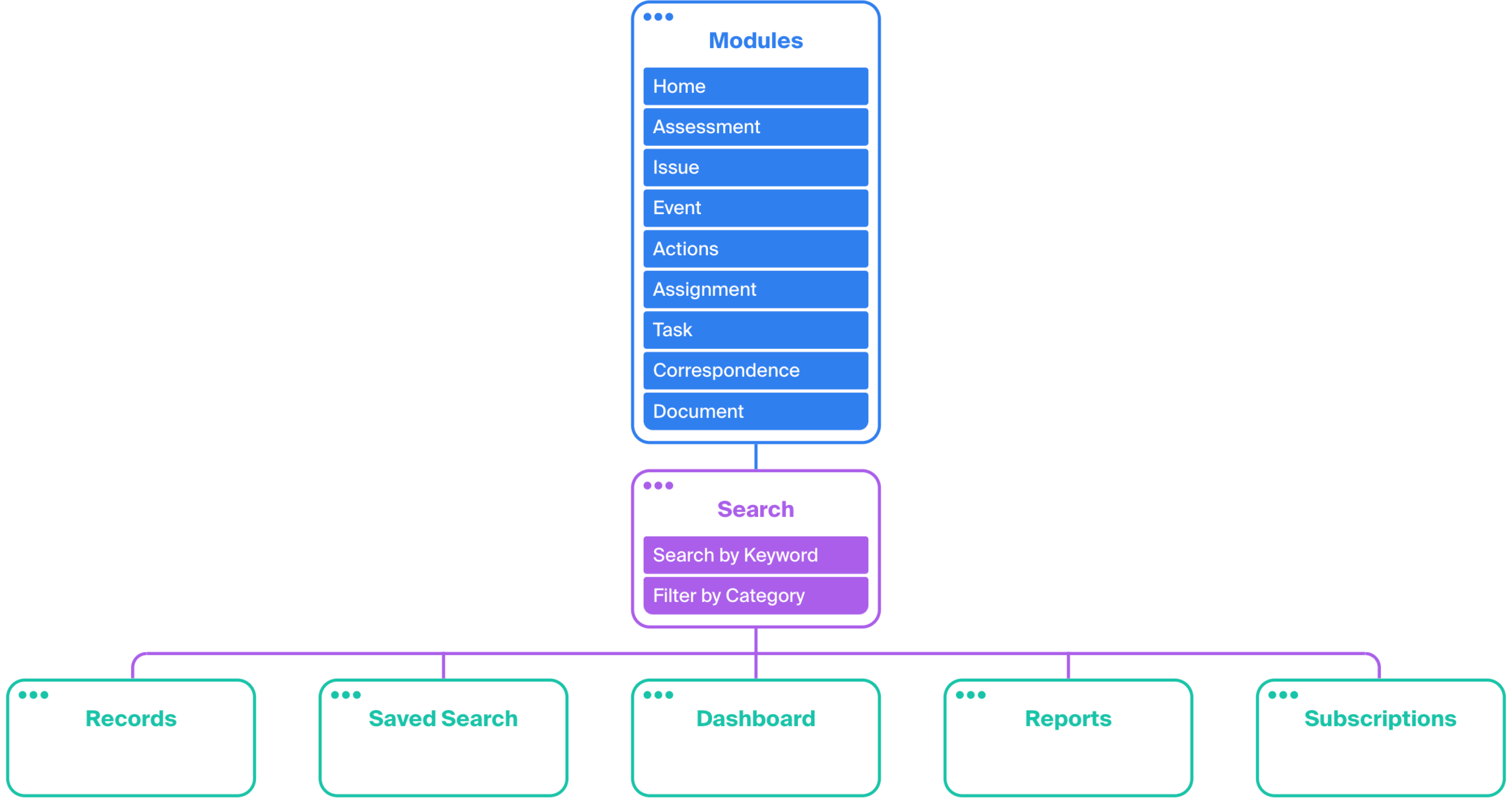
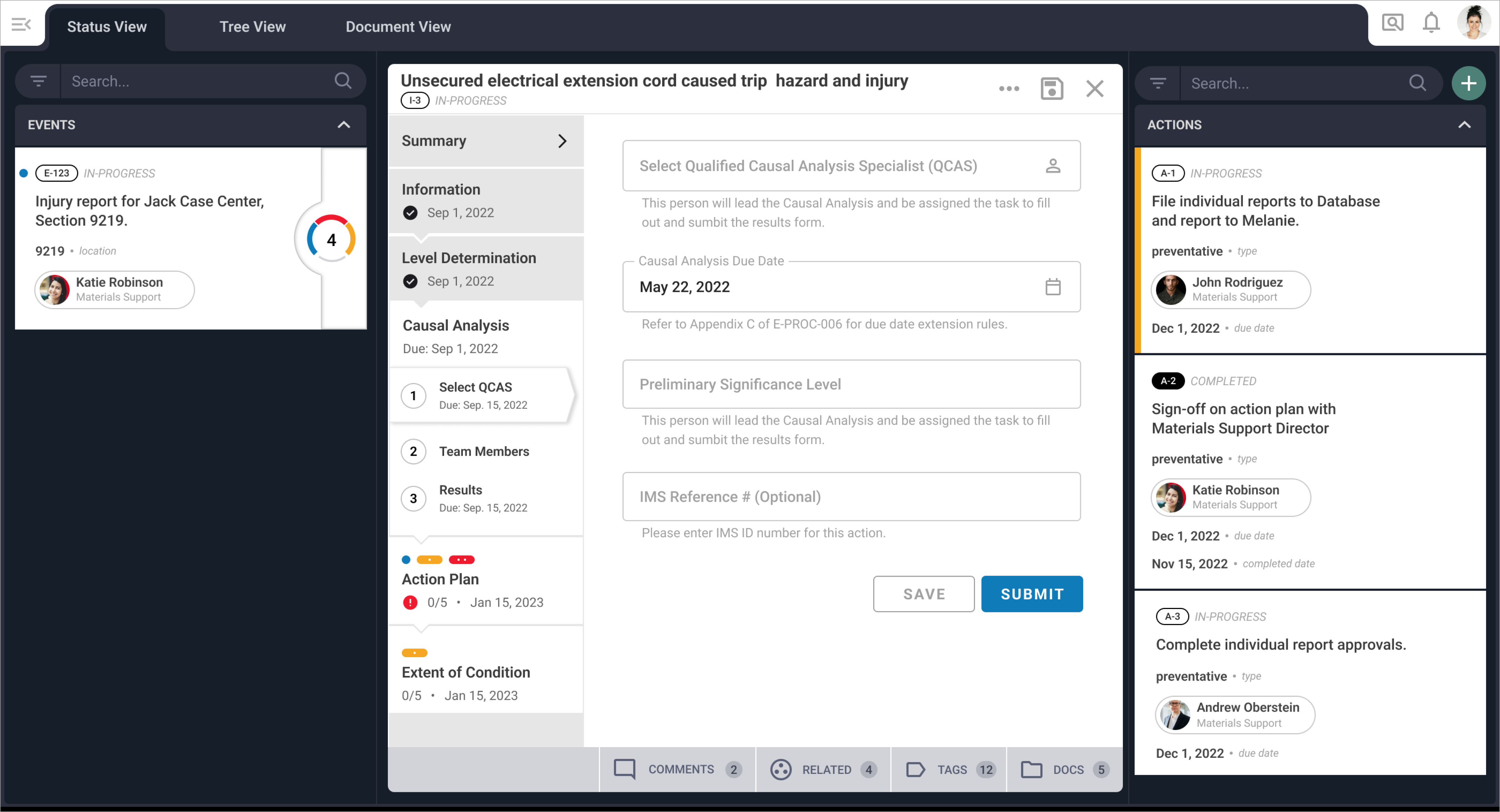
Fig. 01: A simplified sitemap of the Titan platform shows how the search feature is central to work outputs.
Problem + Usability Interviews
Users indicated the platform’s search functionality—a central set of features necessary to find database records, manage work, and produce reports—was overwhelming and confusing, leading to avoidance and frustration. Ensuring the search functionality is usable is essential to users’ work outputs.
Usability Interviews
To learn more, I conducted eight usability interviews with individual contributors and managers to identify pain points and validate their experiences.
Alignment
Making sense of it all
Following the interviews, I clustered the responses by category and analyzed the groupings for primary insights.
- The search process was difficult for individual contributors, who needed to perform simple queries yet had overwhelming options available.
- Users struggled to confirm the accuracy of their searches when they did not see the searched-on value in their database.
- Users wanted more information about the results, but their current process of opening records individually was time-consuming.
How Might We + Outcomes
How might we redesign the search experience around commonly searched terms to make the process clear and efficient?
How might we help users validate their searches so they are more assured in their results while transitioning to the next step of their workflow?
01
Simplify UI + Provide More Filters
Reduce the number of options within the search menu to easily find fields. Provide users with more accessible options to create search filters.
02
Customizable Grids
Add, edit, and remove columns from the database to validate search results.
03
Preview Record
Preview the record summary without navigating away from the results page.
Re-designing the search experience.
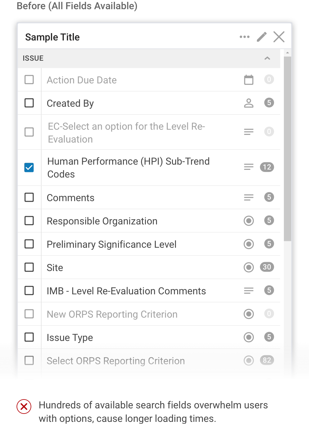
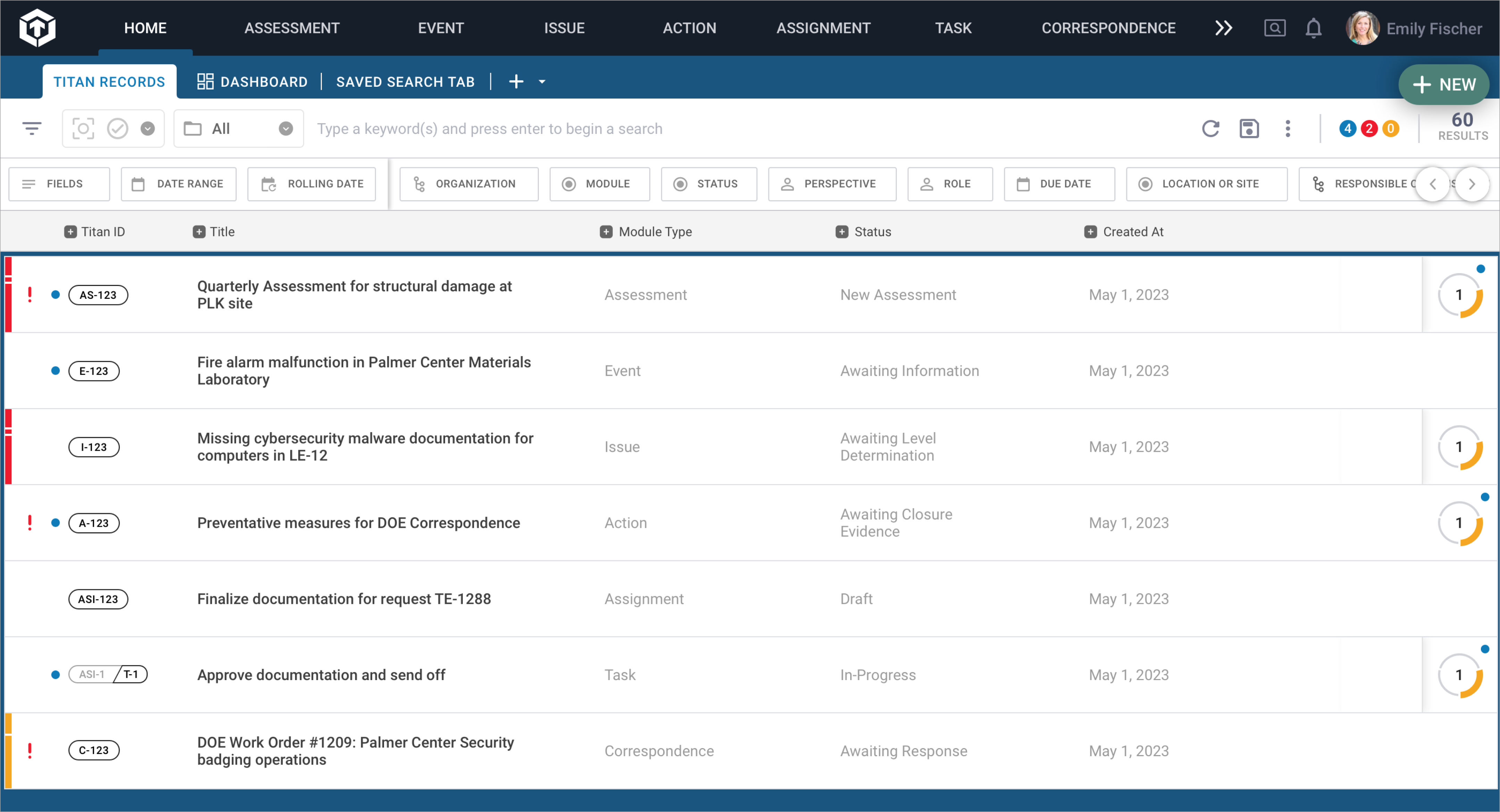
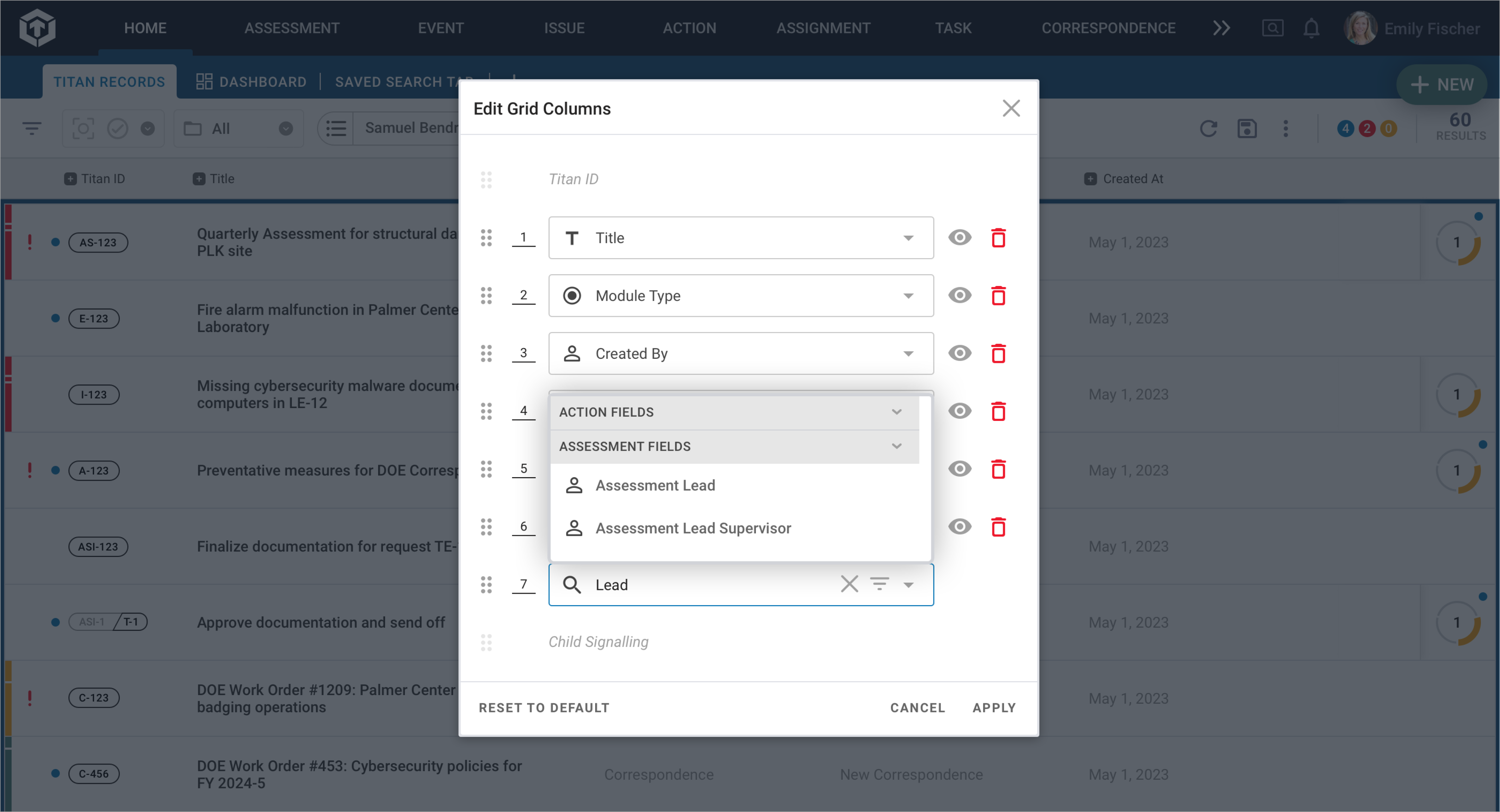
Users were initially presented with every field available in the platform when using the filter option. We commonly heard them say this was overwhelming, and they were likely to ask a more capable user for assistance rather than continue creating a query.
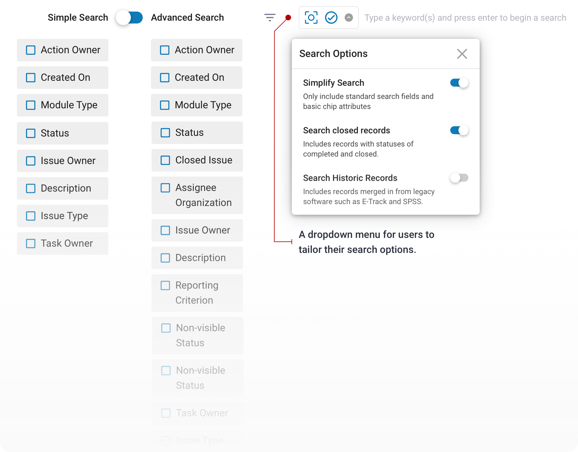
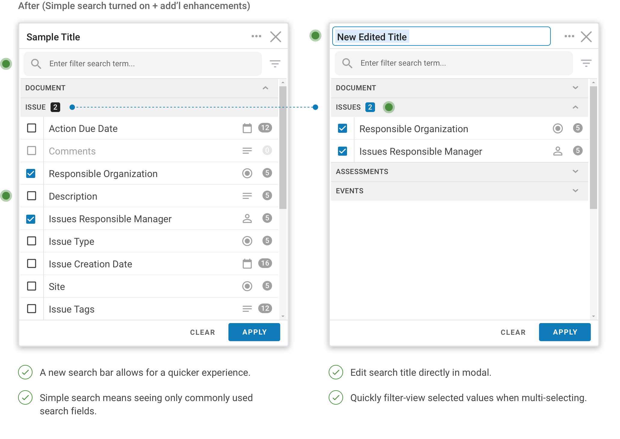
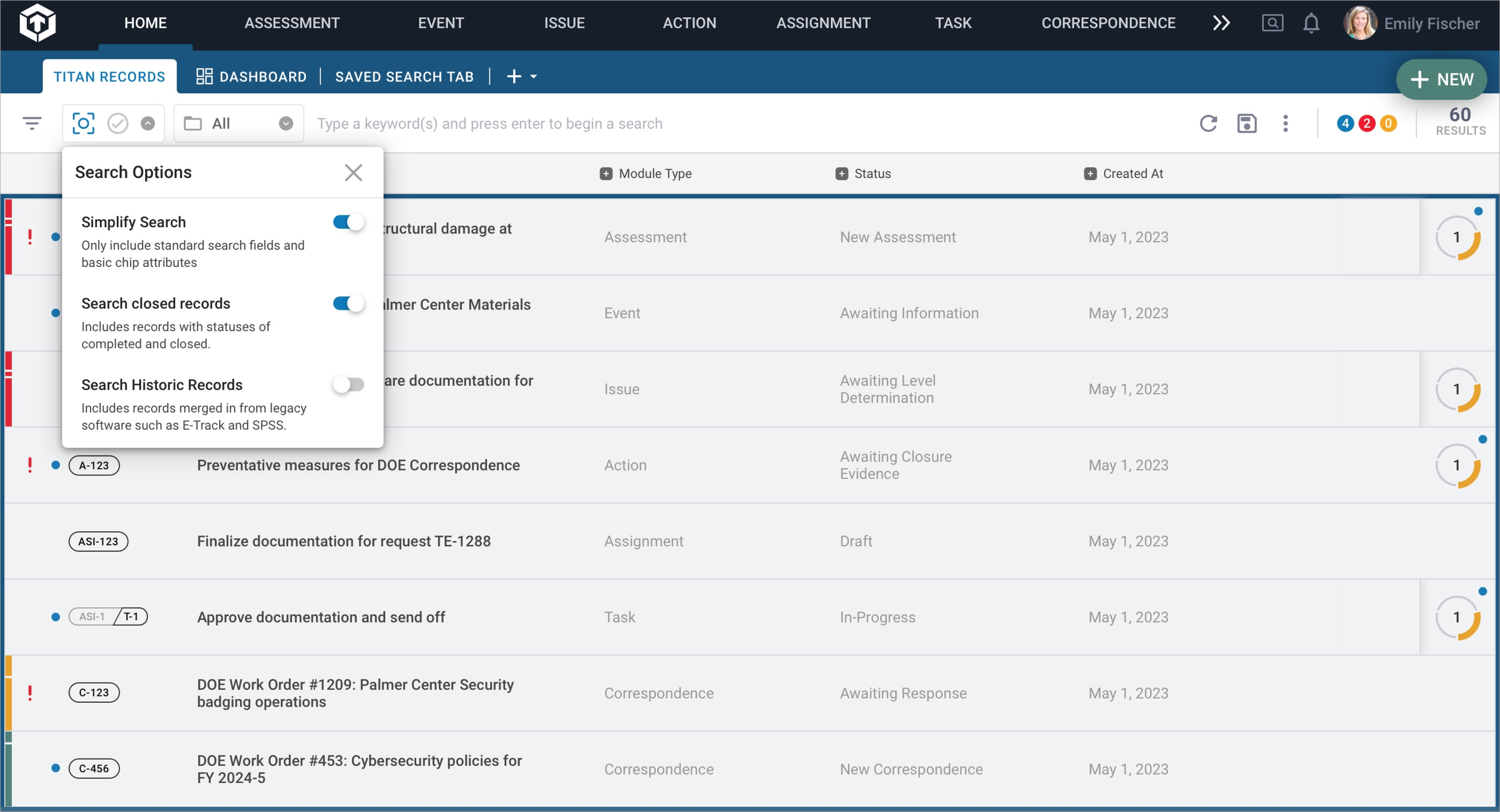
- A new simplified search means seeing fewer but more pertinent choices first. The top search fields are kept visible throughout, shortening the list of options.
- Users who need to create more complex search queries that include related records, completed records, and more esoteric fields can do so through an accessible dropdown menu.
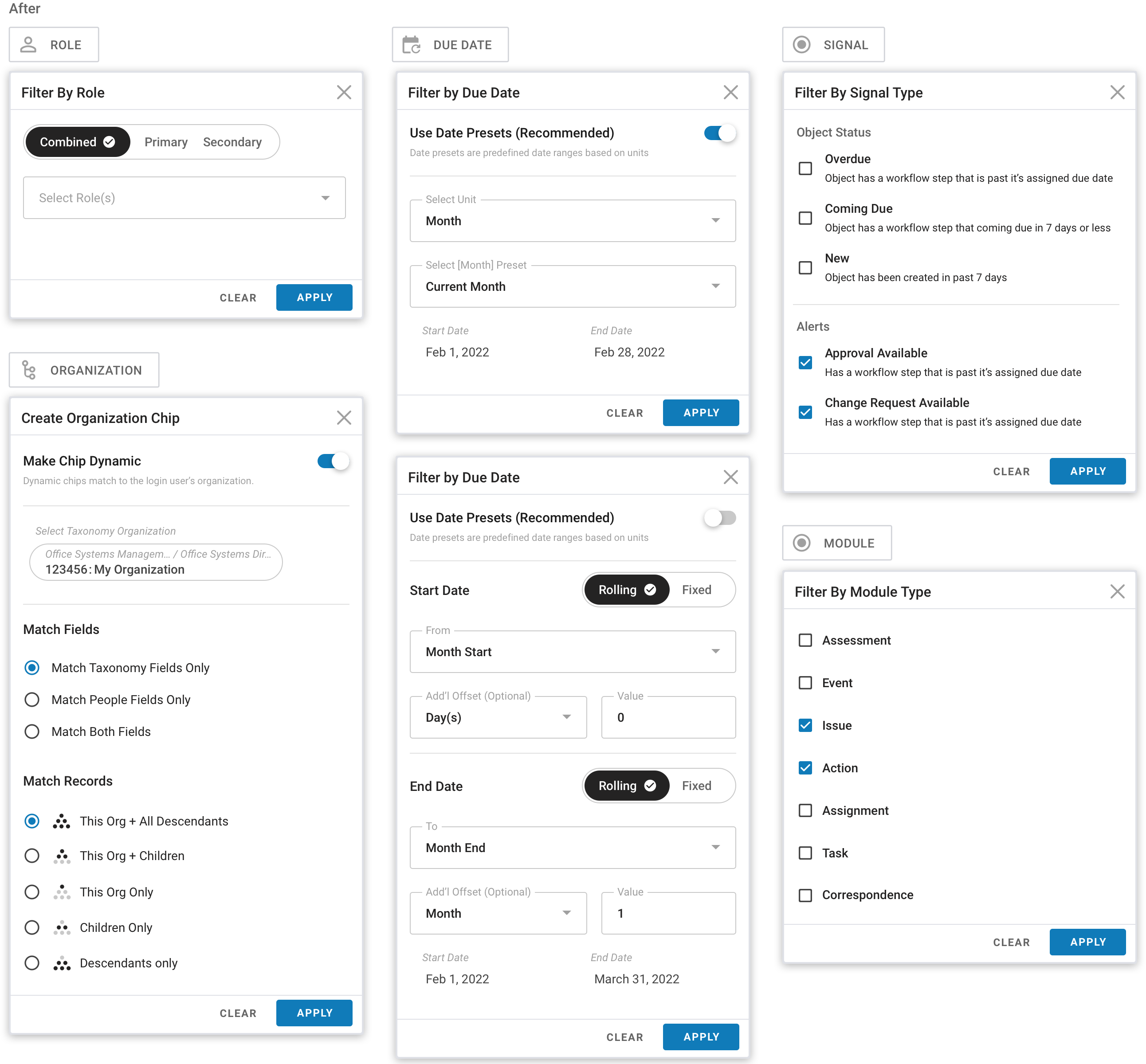
Fig. 04: Updates to the search modal allow users to edit search queries, find search fields easily, and show/hide unselected field values.
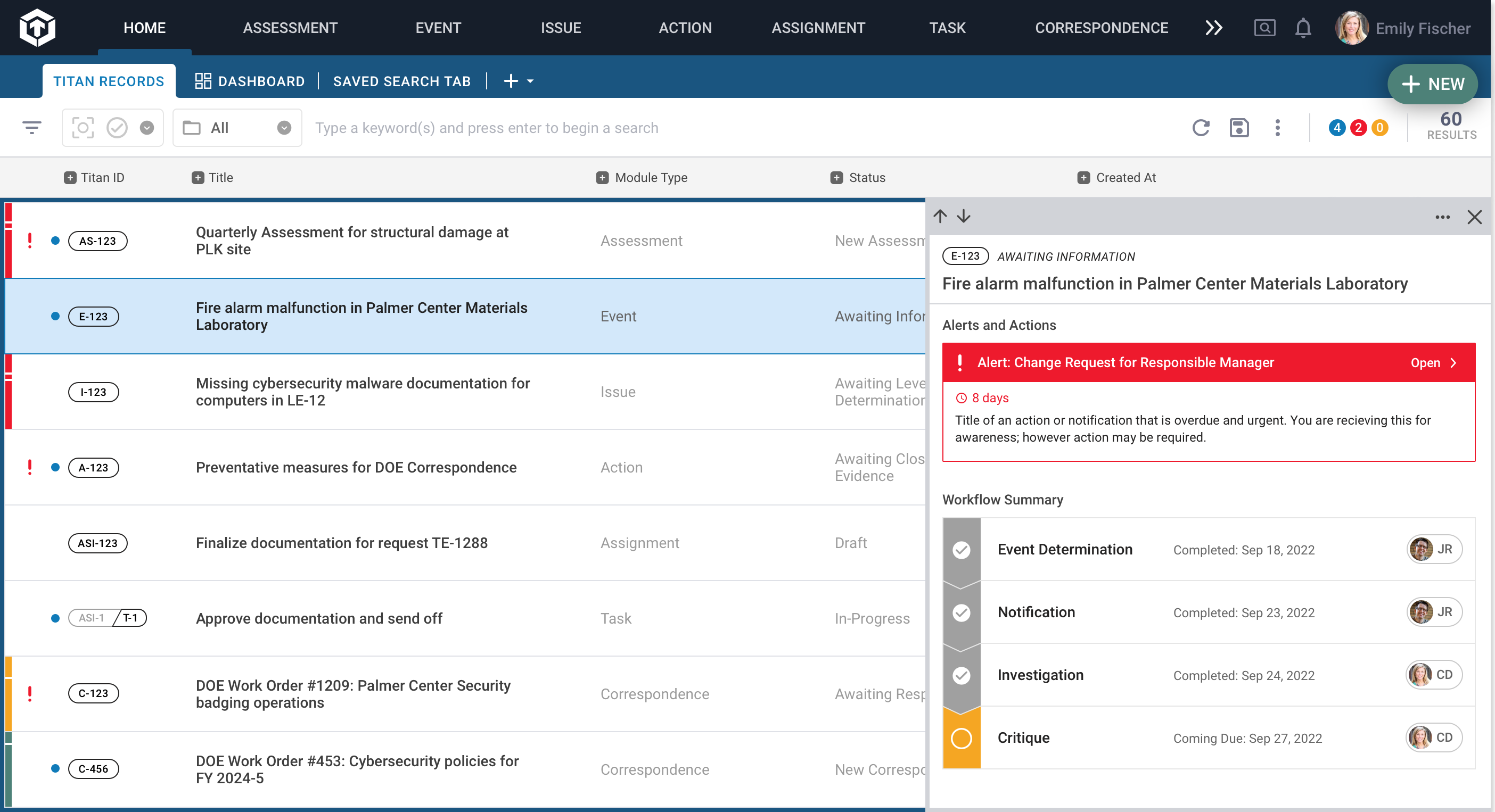
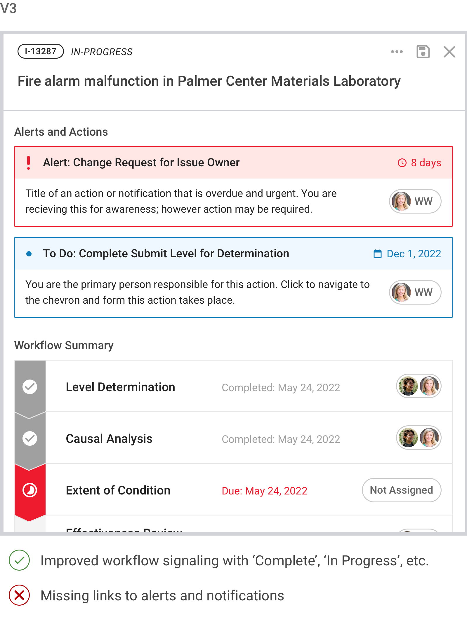
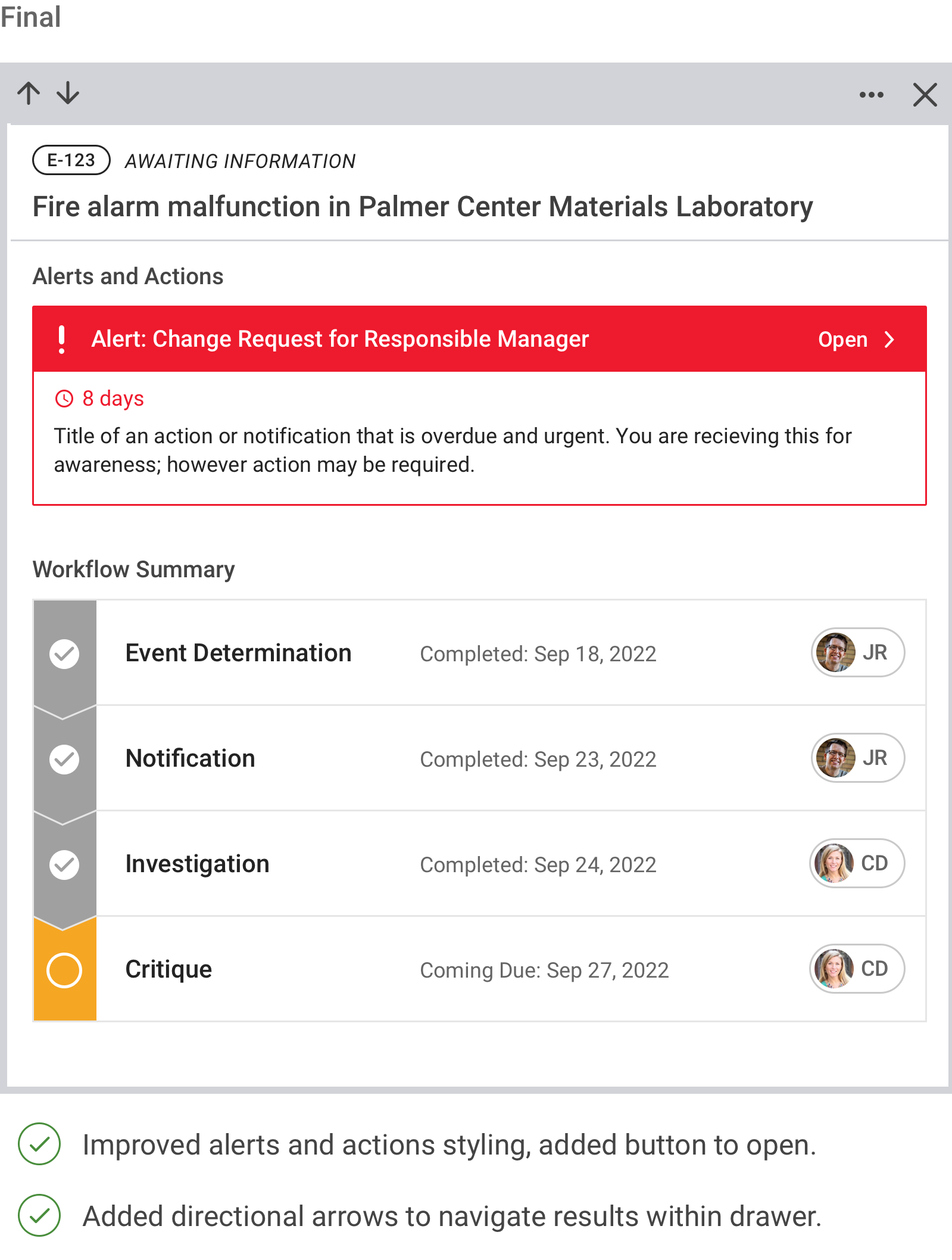
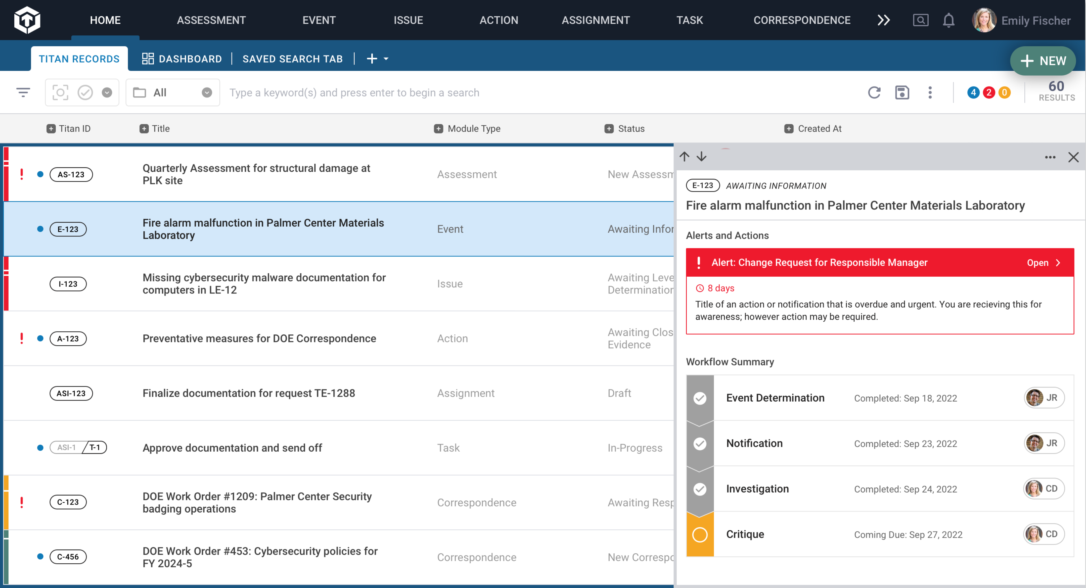
Summary Preview Flyout
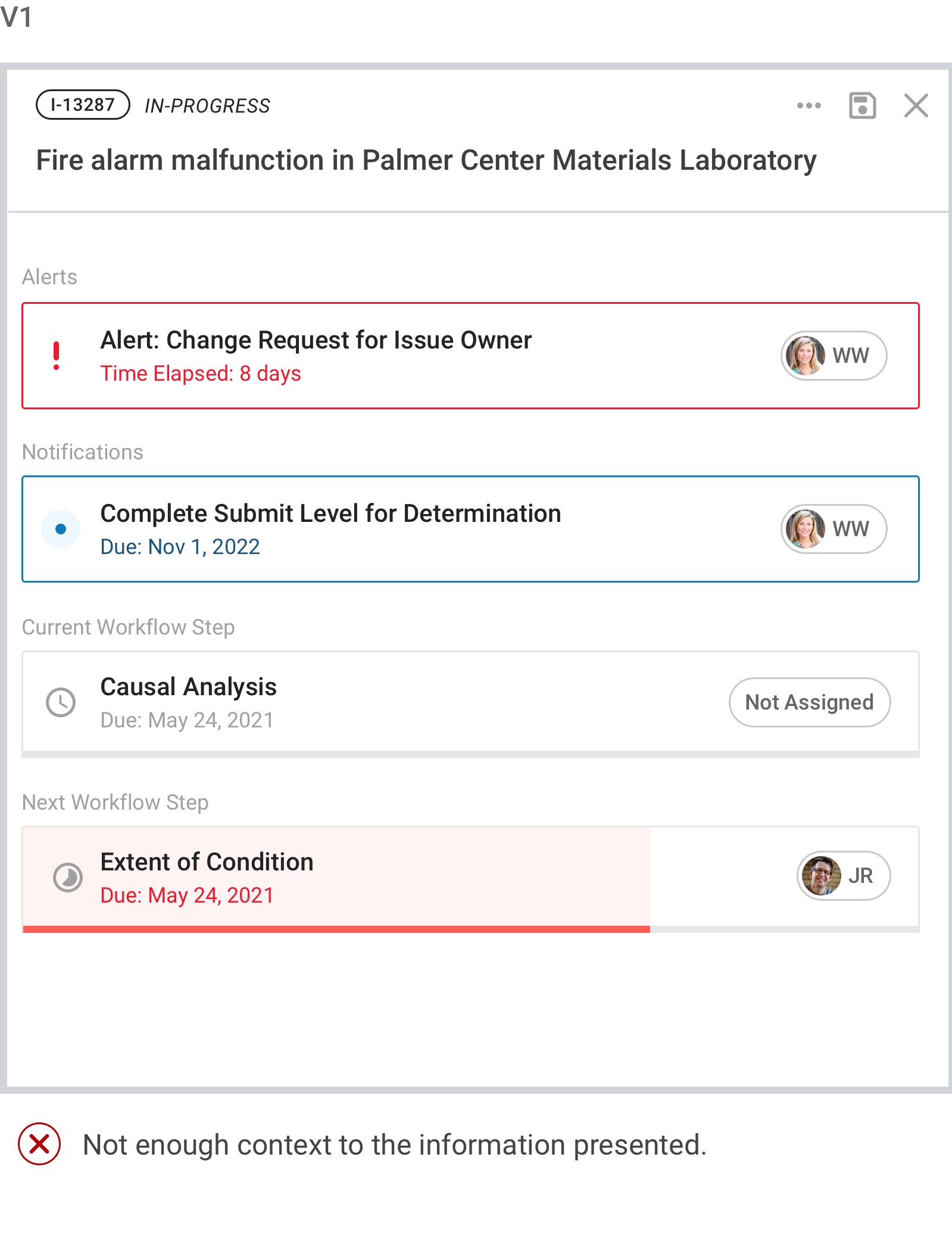
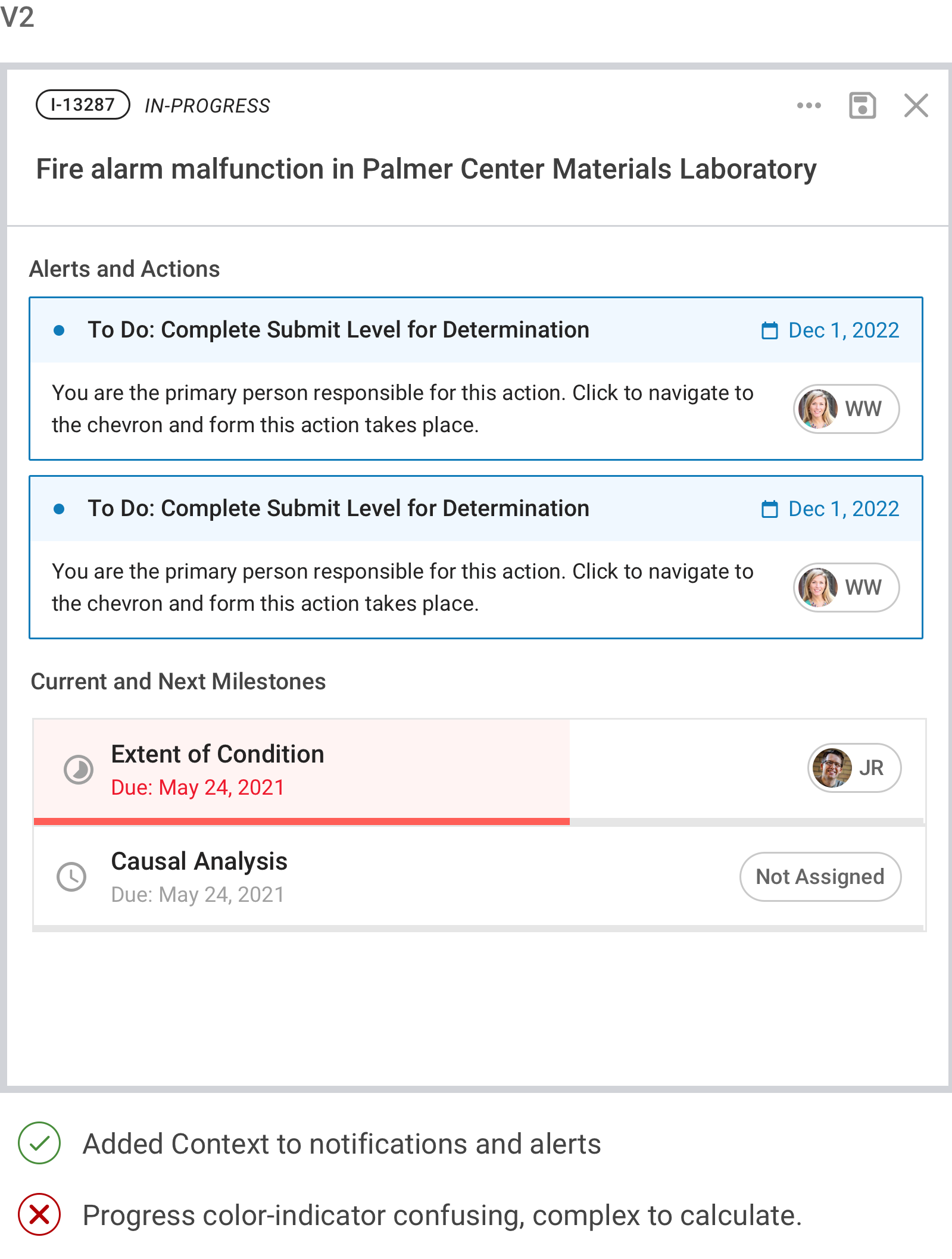
After a complete search, managers wanted to know a record’s status beyond what was visible on the surface—what step in the workflow a record was at, what the next step was, when it was due, and who the next responsible actor was. While opening a record to its main view was an option, it moved the user away from the search page and required a lengthy form load.
An improved search process for more confident users.
Outcomes + Impact
I took on an enjoyable challenge with this project by introducing a usability research process to my team. Although conversations with end users happened fairly often, formalized and documented interviews like this one were new. Search queries rose to 2,200 a day from a user base of 550, and we received many positive reviews from our users after shipping the new features.
The outcomes included a more straightforward search process for users, more confidence in their search results, and an easier path to viewing workflow summaries. With the search functionalities locked down, my team could move forward in building Titan's dashboard feature—another central component driven by search.
Reflections + Challenges
- Stakeholder buy-in and alignment were essential to me. I accomplished this by sharing the research plan, objectives, and a draft of questions with stakeholders.
- While this process was new to our team, the research went smoothly, was well-received, and led to prioritization and release of powerful features.
- Throughout the research, we identified that the two user categories had significantly different approaches and needs for using the search feature. Splitting the research efforts into two (one for managers and executives and one for individual contributors) could have further personalized the research process.
- Introducing usability metrics to our testing can provide a more detailed, precise baseline of where the users are and how well the improvements or new features help.
