🤝🏼 Strengthening partnerships on 70K grant opportunities to secure more federal funding for 530+ state and local governments.
I joined USDR a year after the successful launch of their grant finder tool, as it faced a sustainability challenge—partners weren’t willing to pay for a product competing with free alternatives. At the same time, a new opportunity emerged: the need for a more collaborative grant-seeking experience.
Working with a cross-functional team, I helped refine the UX strategy and design new features that fostered collaboration, strengthening applications and increasing federal funding for communities.
Timeline
Jan — Nov 2024
Role and Contributions
UX strategy
Prototyping / concept development
User testing
Design System management
Team
Samuel Bendriem, Product Designer
Kathleen Henning, UX Researcher
Claire Valdivia, Product Manager
Caitlin Winner, Product Lead
Ty Hendrickson, Engineering Lead
Rethinking Grant Discovery
Federal grants can unlock significant funding, but finding the right opportunities—and the right people to apply with—can feel like searching for a needle in a haystack.
The USDR Grant Finder Tool was designed to help state and local governments discover and manage grant opportunities. It had the essentials: a search interface, filters, and application status tracking.
Yet our government partners kept hitting roadblocks.
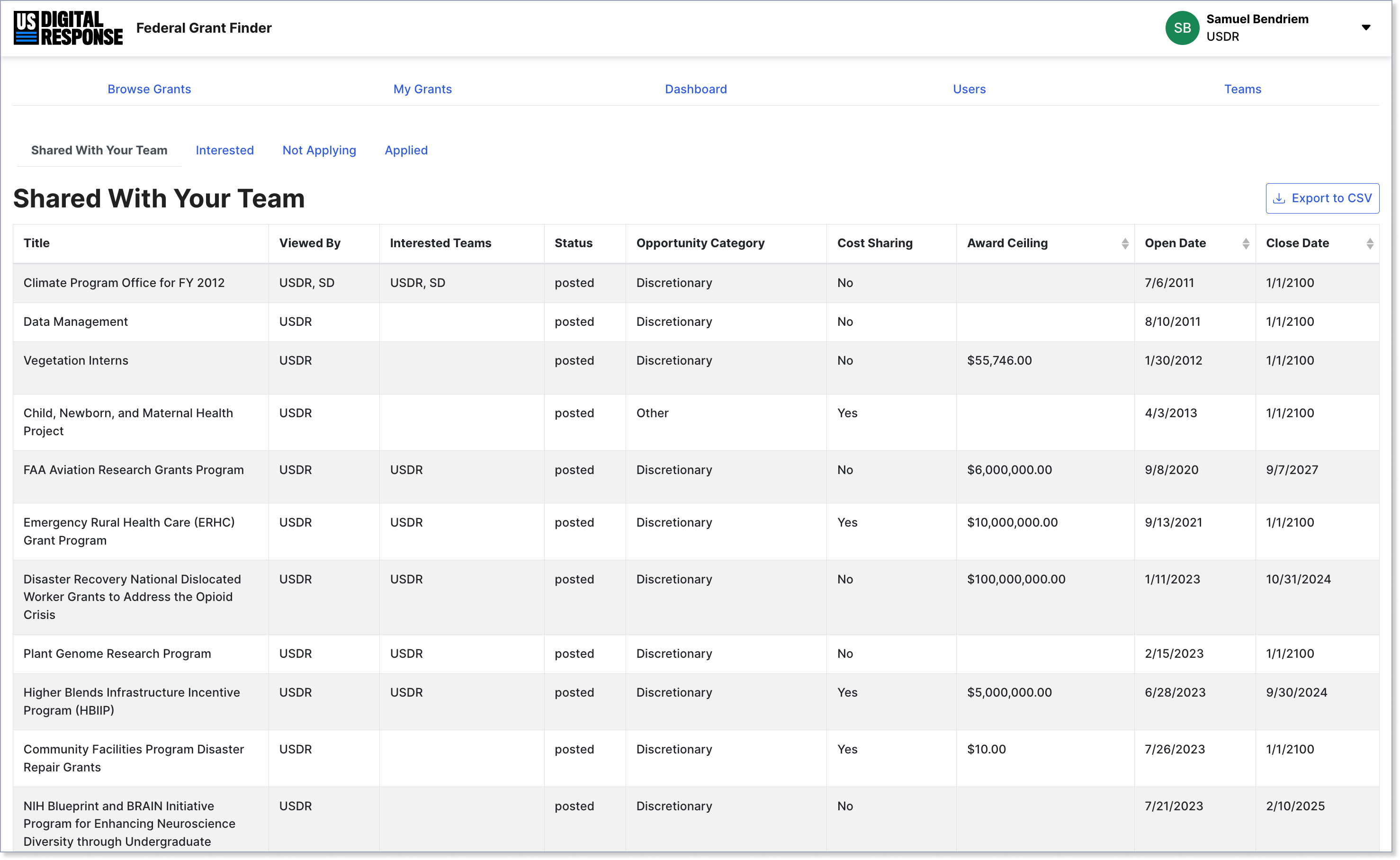
Fig. 01: The first release of the Federal Grant Finder focused on improving the search experience vs. Grants.gov.
Grant coordinators still had to manually connect agencies and nonprofits—an intimidating task that often led to missed funding, rivaling duplicate applications, and lengthy workarounds. Without clear visibility across their network, smaller organizations struggled to compete and navigate complex requirements.
As federal and state grants increasingly required multi-entity applications, the lack of coordination made these opportunities harder to win. Stakeholders needed more than search results; they needed a way to signal interest, identify partners, and coordinate efforts before deadlines passed.
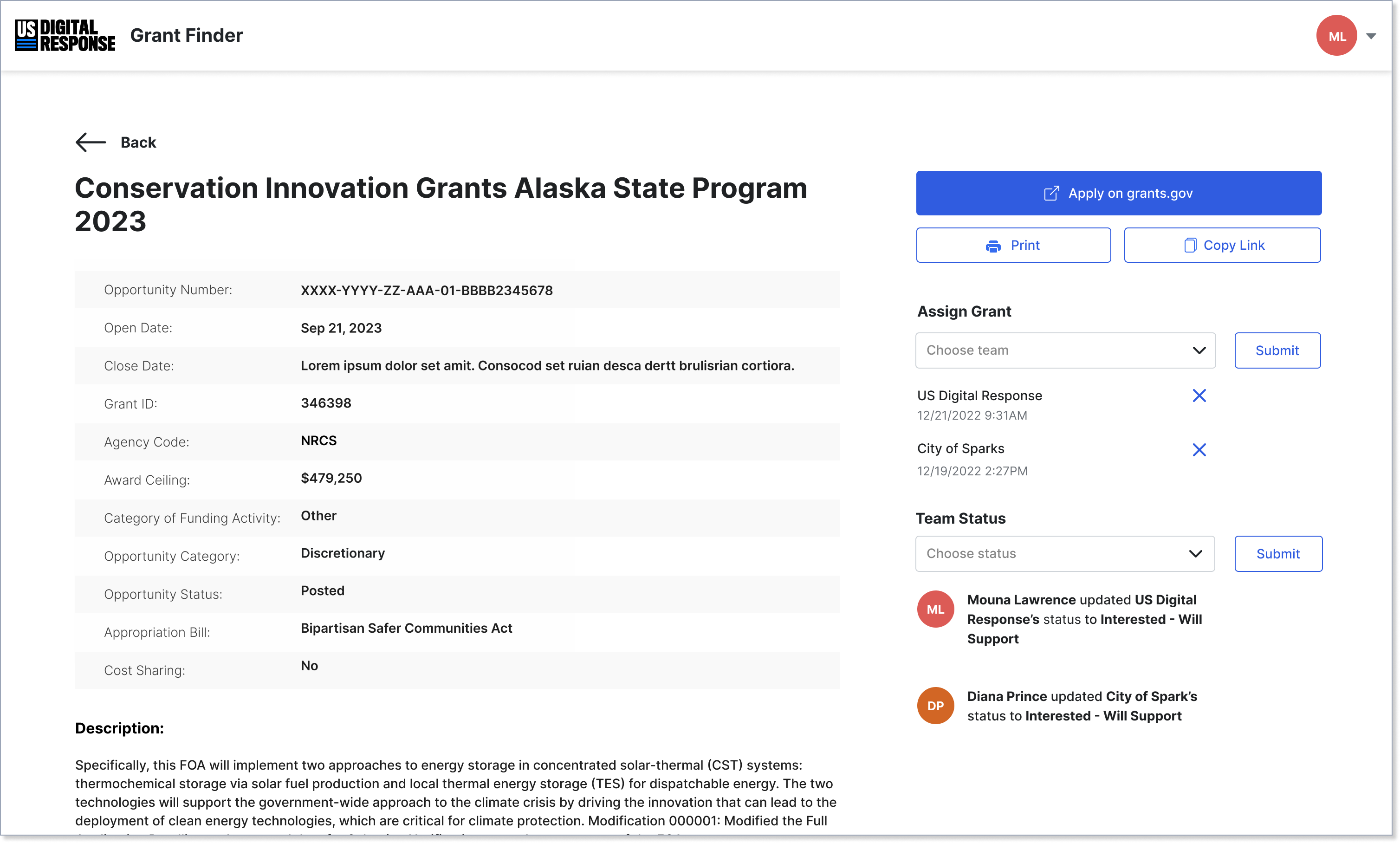
Fig. 02: Grant details pages allowed teams to save and share grants with partners.
For USDR, this wasn’t just a challenge—it was an chance to transform how agencies worked together. The opportinity space was clear: transform the Grant Finder Tool from a federal grants database into a collaboration platform.
✅ Faster partnerships:
Streamline the coordination process to form stronger teams in days, not weeks.
✅ Maximize funding potential:
More organizations could pursue competitive, multi-entity grants.
✅ Scalability:
Broadens the impact USDR’s efforts can reach.
Joining at this pivotal time, I recognized how USDR could transform a complex process into a successful SaaS offering—and I was eager to help make that happen.
Barriers to Networking
Our partners indicated the core value of the Grant Finder Tool wasn’t enough. They wanted more than a search tool—they needed a way to connect with others in their network to build stronger applications.
The problem? How collaboration and forming partnerships happened was ambiguous, and our ability to meaningfully update the software unclear.
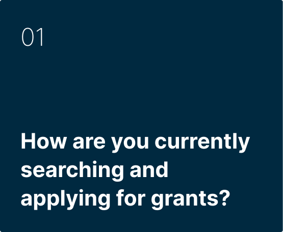
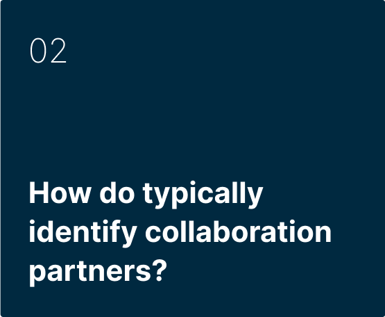
To learn more, we spoke with grant coordinators and grant applicants from across the country—in Montgomery County, MD and Las Vegas, NV for example—and inquired about what collaboration looks like right now.
Our research revealed three major roadblocks stopping grant-seeking teams from forming strong partnerships:
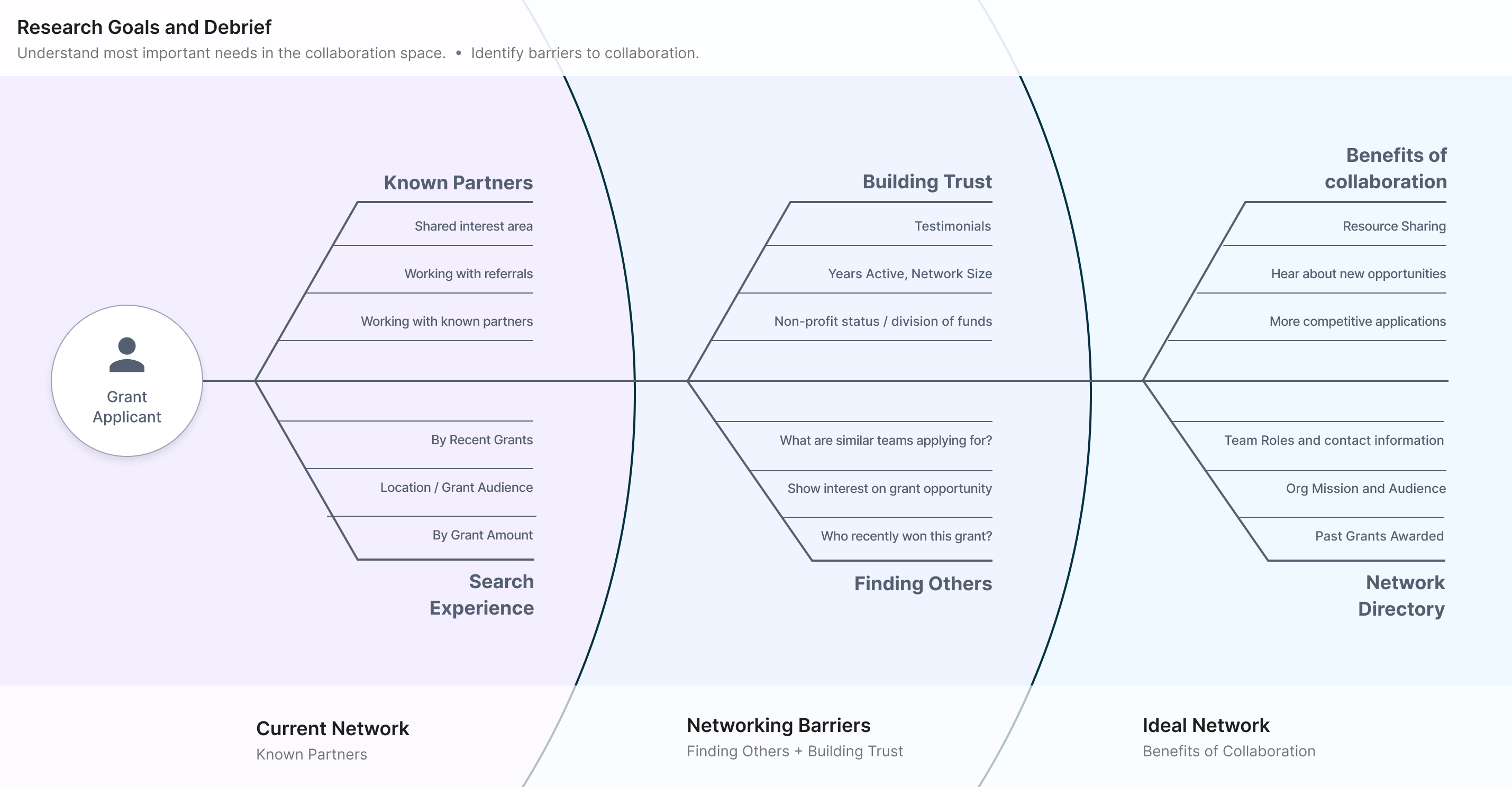
Fig. 03: Barriers to collaboration diagram.
1️⃣ Blind Spots in the Network
Coordinators had no visibility into who was applying for what, making it impossible to facilitate the right connections at the right time. Without this insight, even the best opportunities could go unnoticed.
2️⃣ An Overwhelming Start
For smaller or newer organizations, navigating the process felt like an uphill battle. They often struggled to find the expertise or support they needed.
3️⃣ Uncertainty Breeds Inaction
Teams were often unsure of who was available to partner with or whether a potential collaborator was a credible fit. This uncertainty led to siloed efforts, which resulted in missed deadlines and ultimately, missed funding opportunities.
Focusing the Strategy
Our research uncovered a broad landscape of hurdles, but to design an effective solution, we had to narrow the field. Addressing every problem wasn’t realistic—our strategy needed clear priorities.
This was our next task.
Instead of treating collaboration as an open-ended problem, we defined our product North Star: people can’t collaborate if they don’t know who’s out there. From there, we crafted a playbook to translate insight into action—a focused approach to guide the next phase of design and define how we’d measure success.
North Star + Guiding Principles
“Supporting collaboration” inside the Federal Grant Finder is about finding and creating opportunities for collaboration through transparency.
Our goal is to help grant-seekers find and share relevant opportunities, connect with new and existing partners, and align towards collaboration—thereby strengthening applications and increasing funding for their communities.
01
Interest over Intention 🚀
The first step to successful collaboration is showcasing interest early, long before the commitment stage. The goal isn’t only tracking applications; it’s about opening doors to new connections that could lead to stronger partnerships.
02
People over Tools 🤝
A tool alone doesn’t create collaboration—people do. To foster meaningful connections, we focused on making the platform feel more human, surfacing partners who could actively support and strengthen applications.
03
Traction leads to action 📊
Grant coordinators need the right data at the right time to spot collaboration opportunities and rally support. By making information transparent and accessible, we fueled momentum and helped teams act before deadlines passed.
Designing for Connection
The main challenge was clear: people can’t collaborate if they don’t know who’s out there. But even after identifying the strategy, the question remained—how do we embed seamless connections in the platform?
Our goal was to create moments of transparency—surfacing information and nudging applicants to signal interest, find potential partnerships, and kick off conversations.
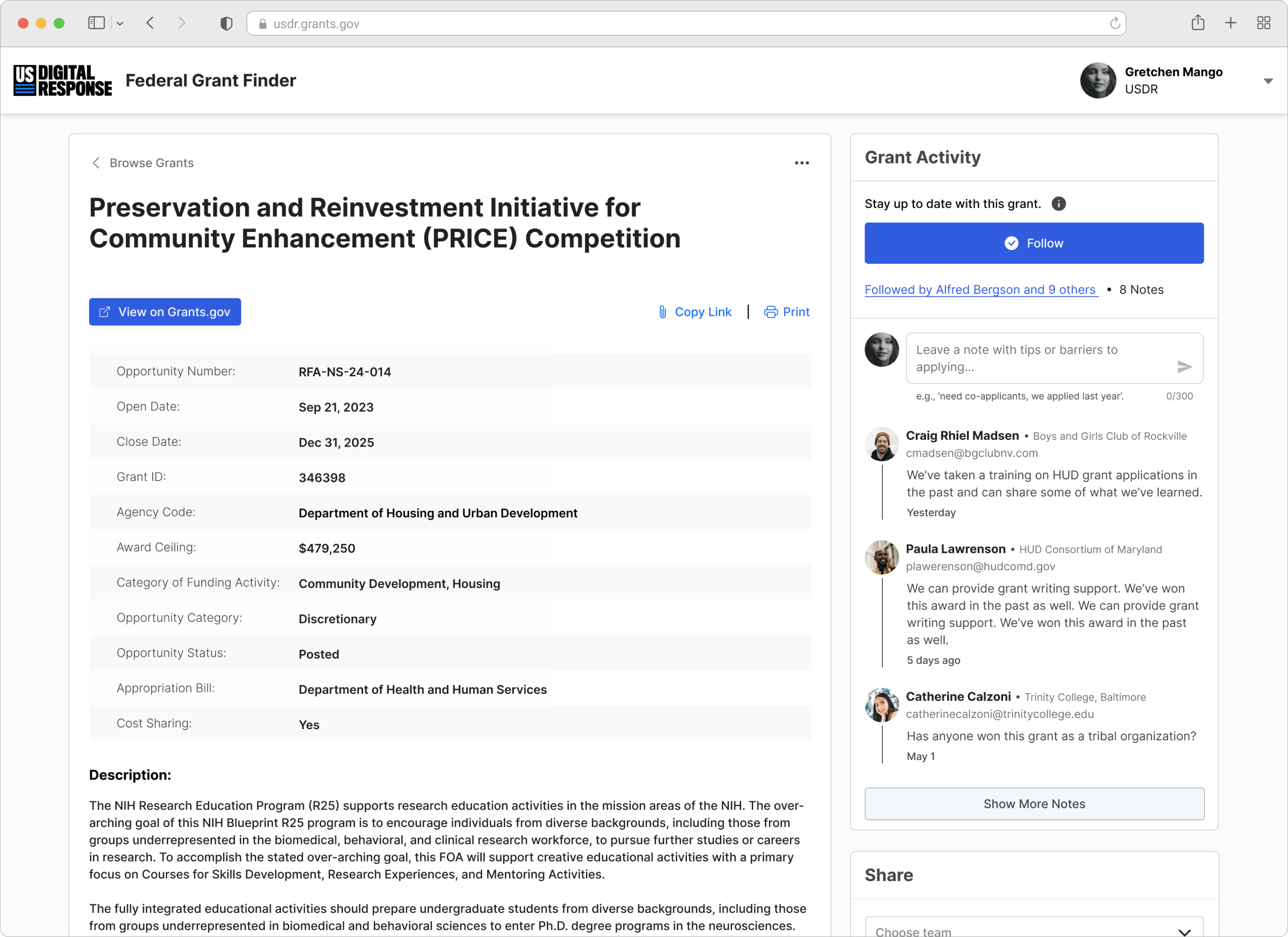
Fig. 04: The Follow Grant feature allows participants to indicate their interest and availability in a grant application.
Following a Grant + Leaving a Note
The first step was to make collaboration visible and actionable.
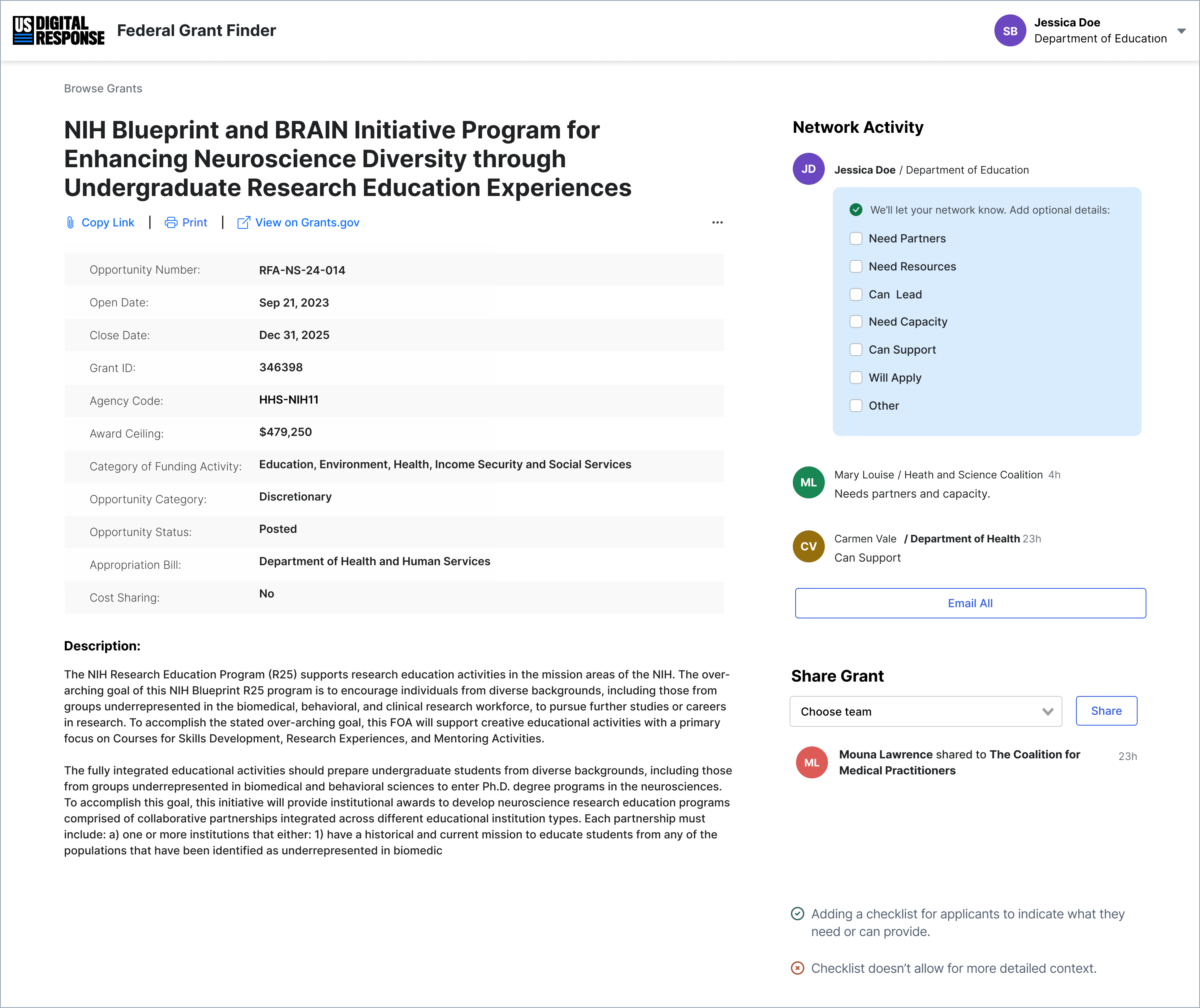
We introduced a way for applicants to follow a grant, adding them to a shared list of interested parties. To give teams a starting point for outreach, we included a free text box where applicants could share their availability, needs, or resources.
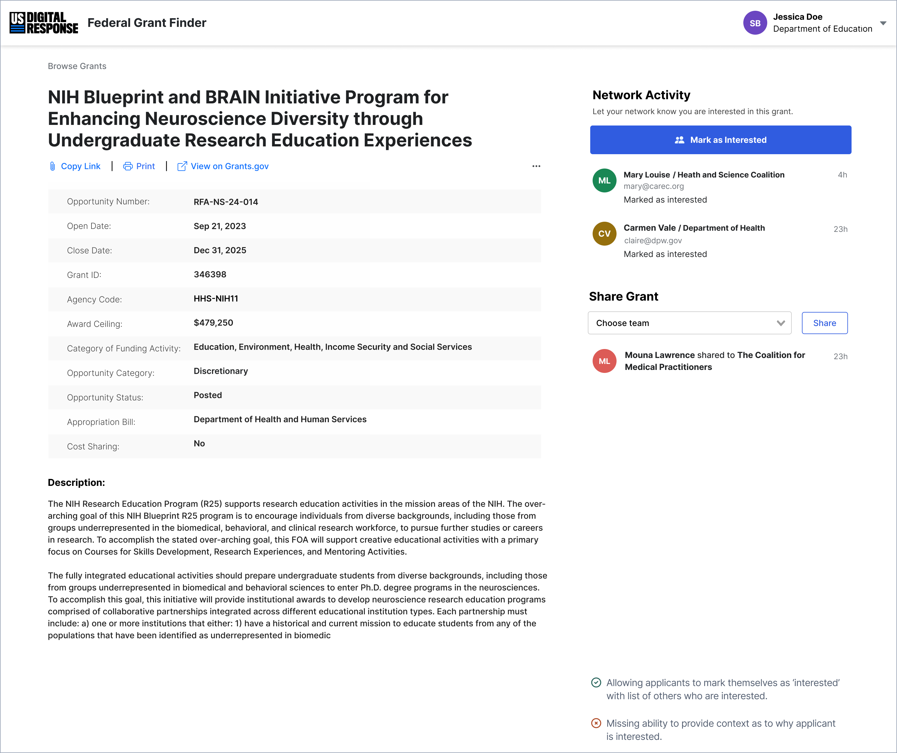
Figs. 05+06: Grant collaboration concept: 'Mark as Interested' (left) and adding contextual information (right).
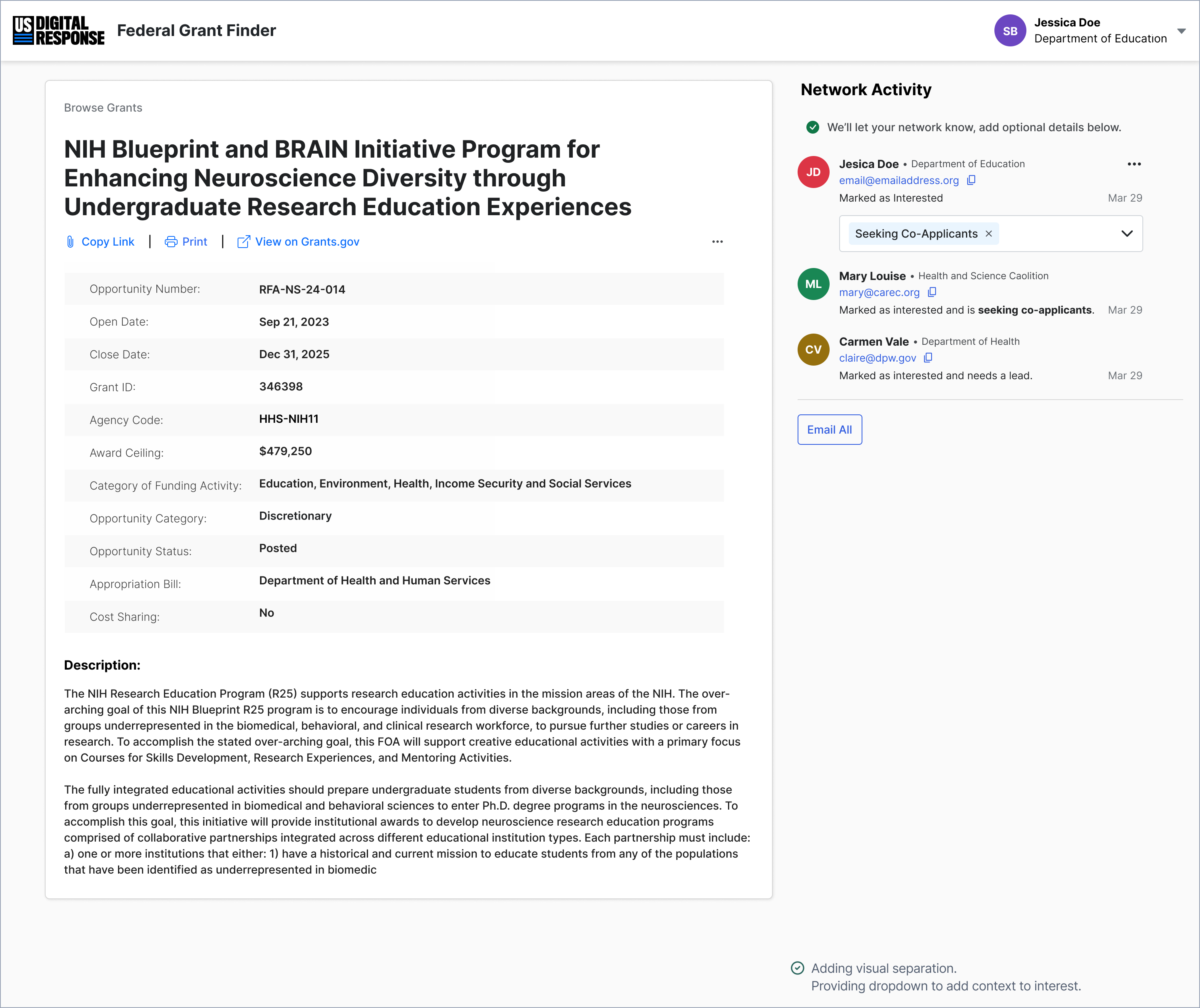
Figs. 07 +08: Grant collaboration concept: Changing the list to dropdown (left) and allowing applicants to leave free-text comments (right).
🔹 Before: Collaboration relied on external emails and known partnerships.
🔹 After: A built-in system made it easy to follow a grant, see who is interested, and start a conversation.
To close the loop, we ensured that email contact information was available within the platform, so applicants could directly connect.
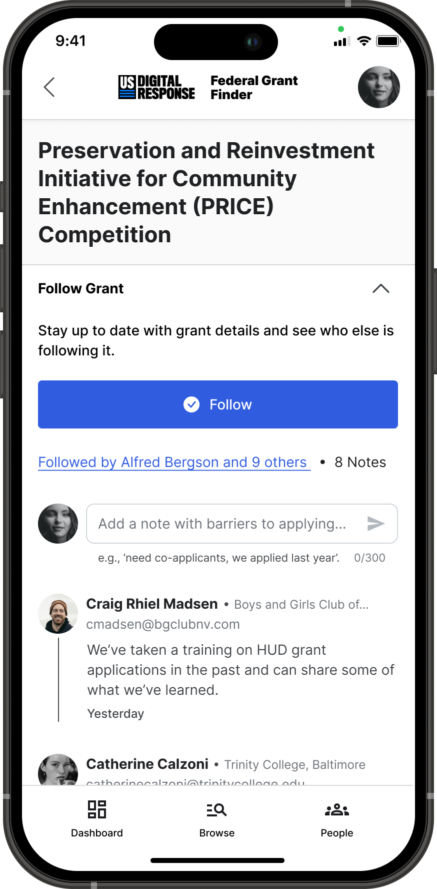
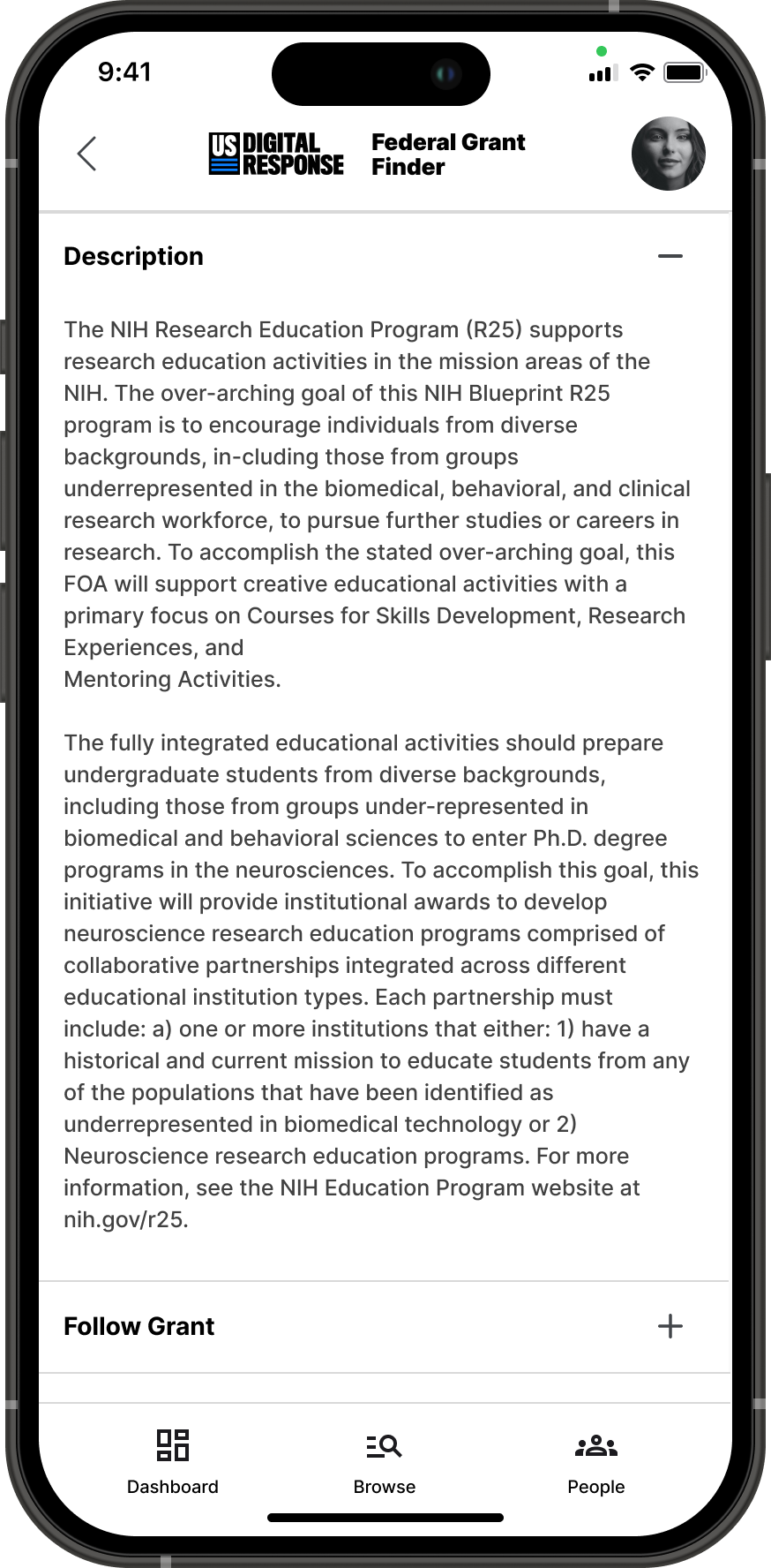
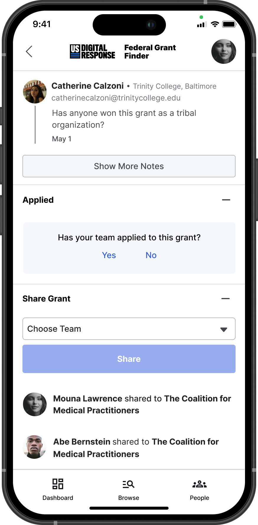
Fig. 09: Mobile screens of the grant detail page.
Encouraging Connection Through a More Human Interface
A tool alone doesn’t create collaboration—people do. But our platform still felt impersonal. The next step was to make it more human and inviting.
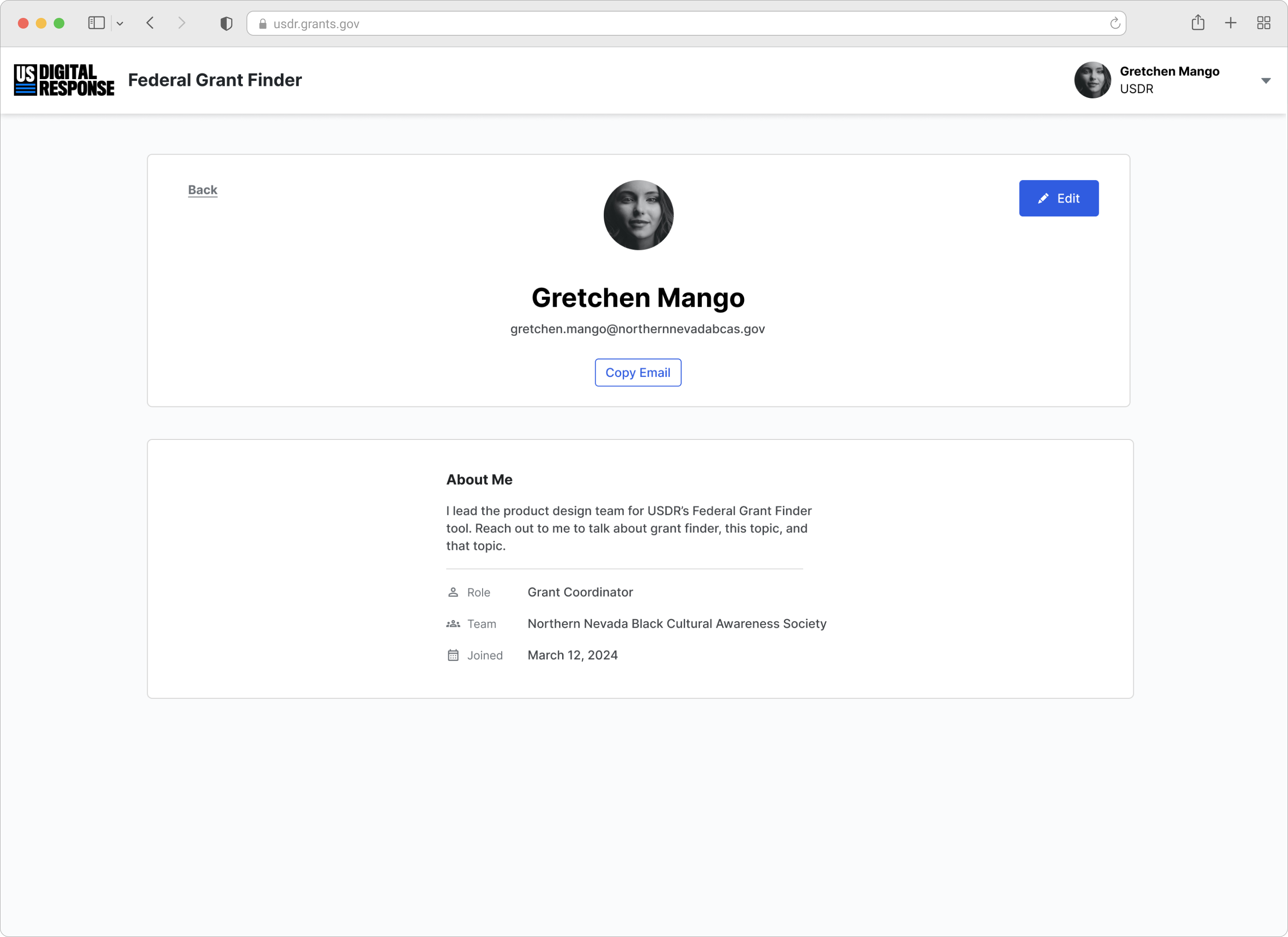
I focused on the avatar component in our design system, iterating to make identities and connections more visible:
Fig. 10: Original avatar component.
Fig. 11: Adding email addresses.
Fig. 12: Highlighting emails and adding roles.
Fig. 13: Adding profile photos and hover modal.
1️⃣ V0 – Default Avatars → Personal initials, limited visibility of collaborators.
2️⃣ V1 – Adding Email Addresses → Stakeholder feedback confirmed that exposing emails would make users more comfortable reaching out.
3️⃣ V2 – Highlighting Roles & Expertise → Users needed more than a name; adding roles gave valuable context.
4️⃣ V3 – Profile Photos & Hover Modal → Final iteration included profile photos and a hover modal for additional information—balancing visibility with a clean, compact design.
Even though adding profile photos increased onboarding complexity, the benefit was clear: familiarity drives trust. With this final iteration, our platform no longer felt like a faceless database—it became a space where real people connect.
Making Collaboration Accessible
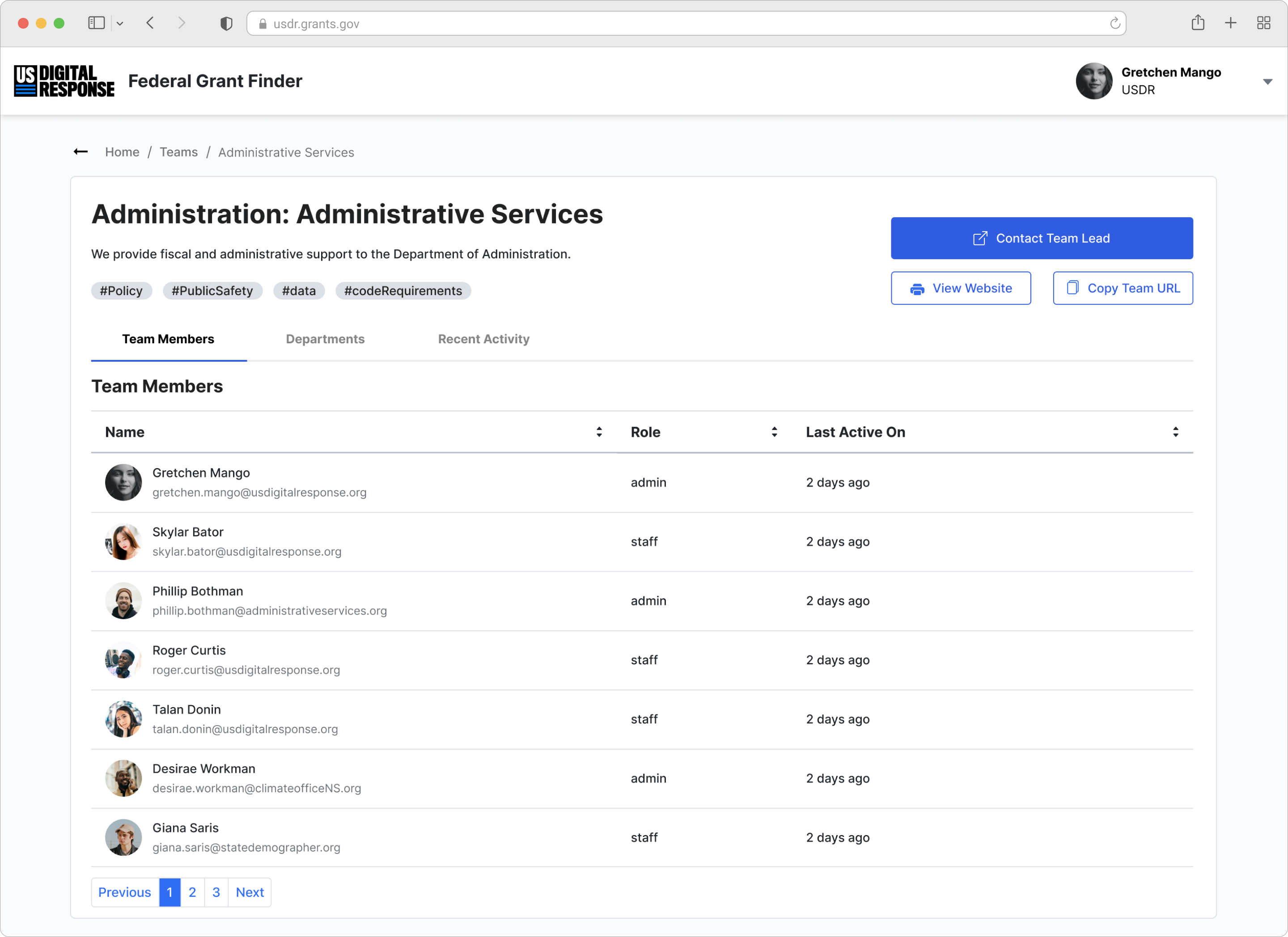
To further streamline discovery, I designed profile pages for users and teams, so applicants can share about who they are, their organization, and their role.
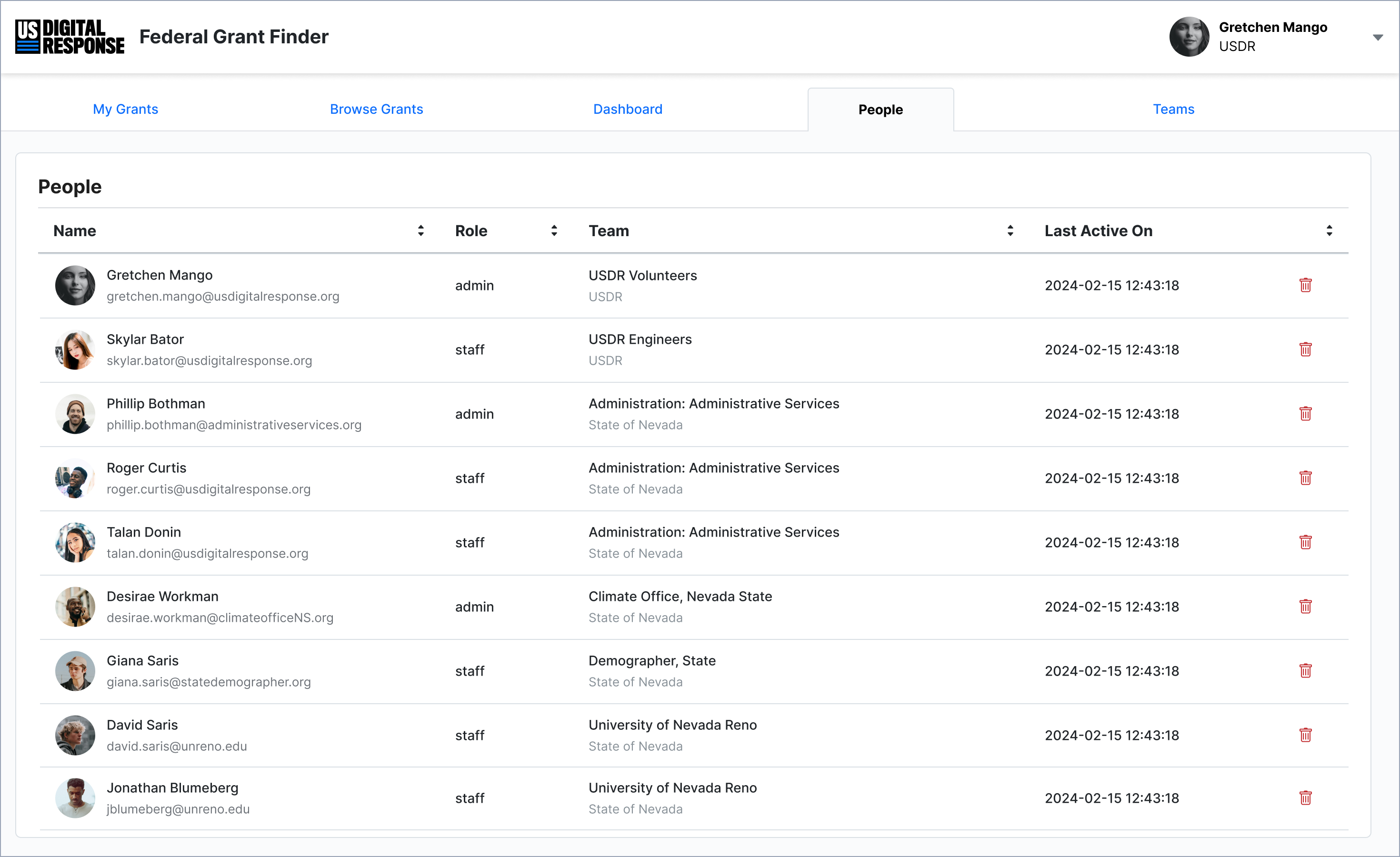
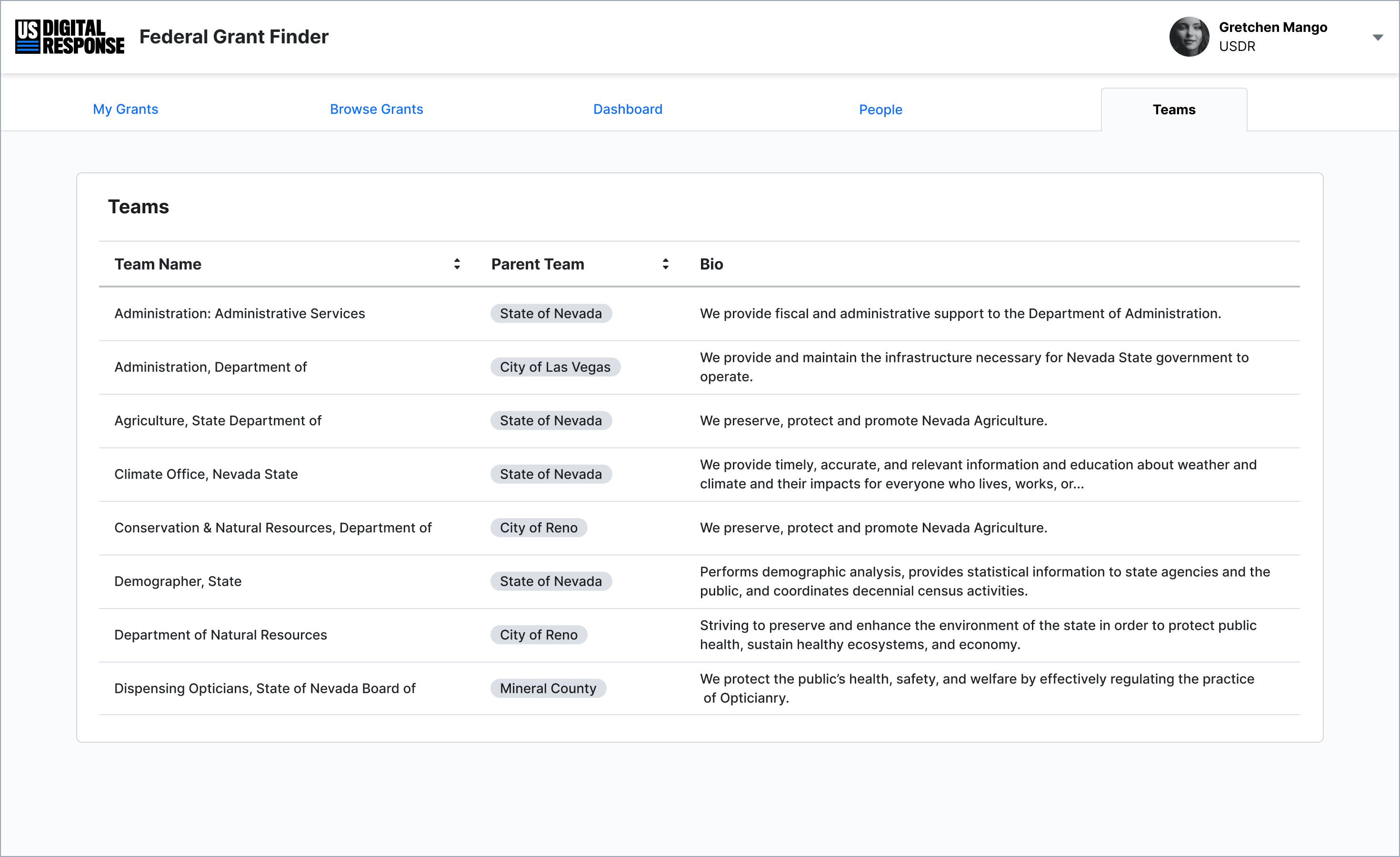
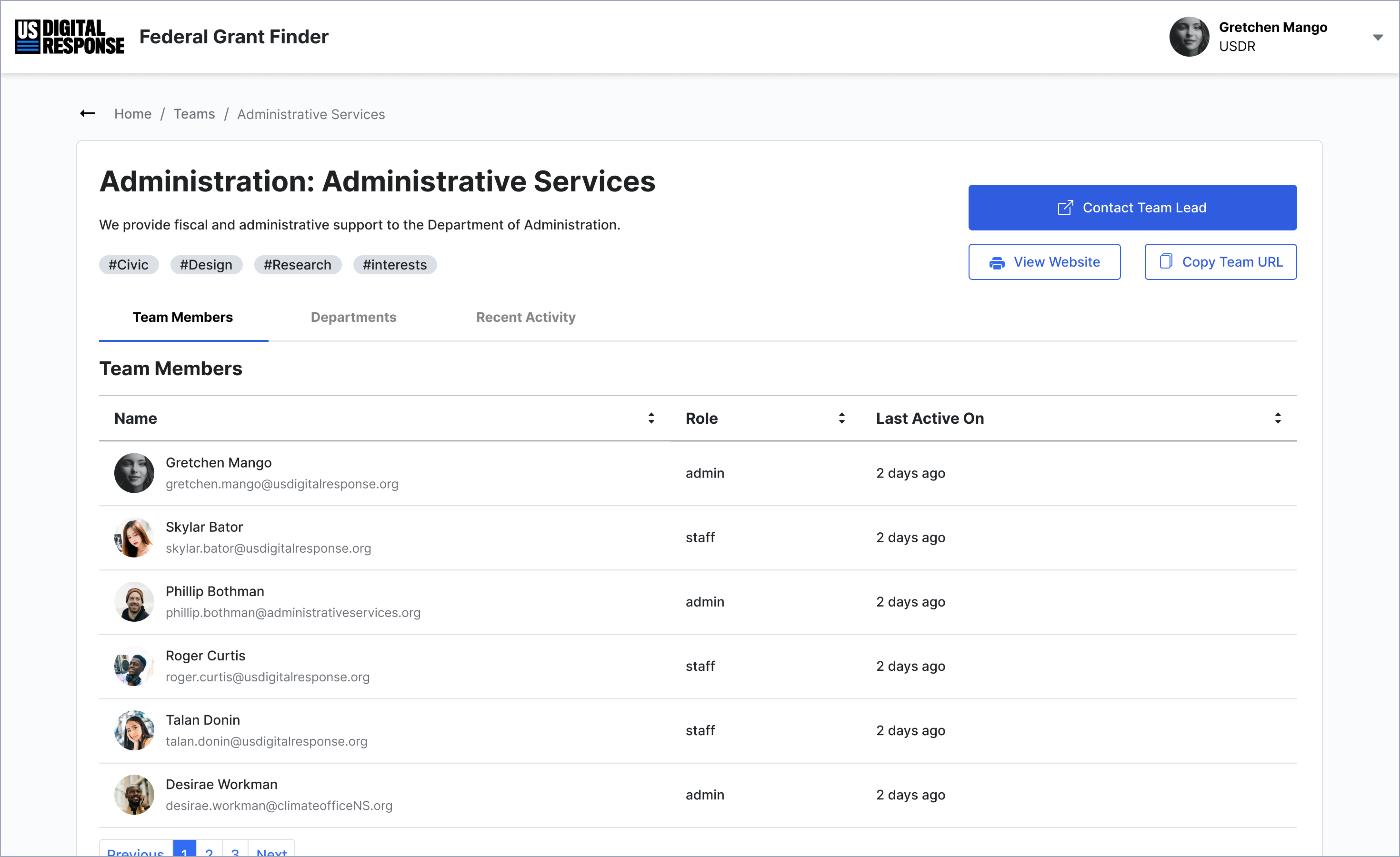
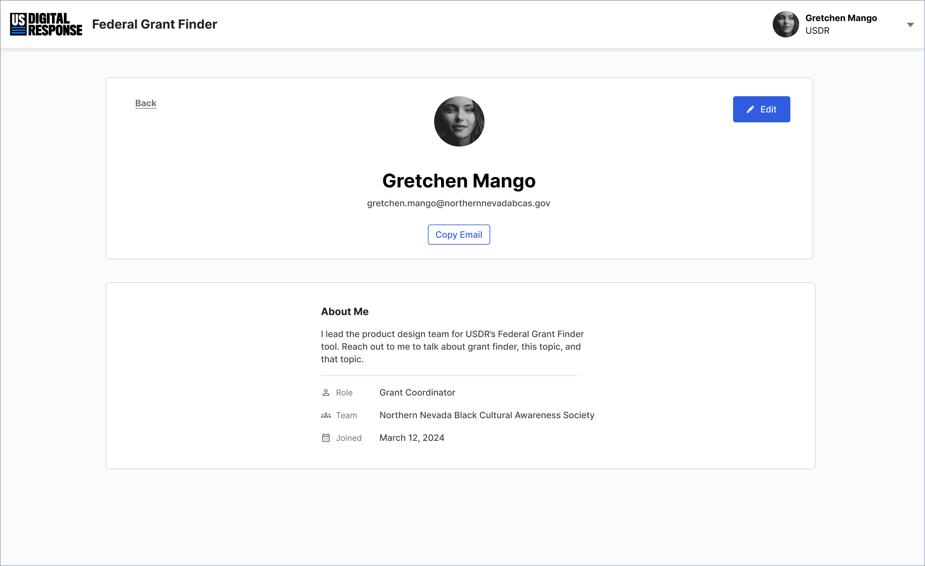
Additionally, we introduced People and Team Directories, making it easier to:
✅ Find partners based on shared interests, past grants, or expertise.
✅ Look up contacts from offline meetings or industry networks.
✅ Expand visibility into new organizations working in the same space.
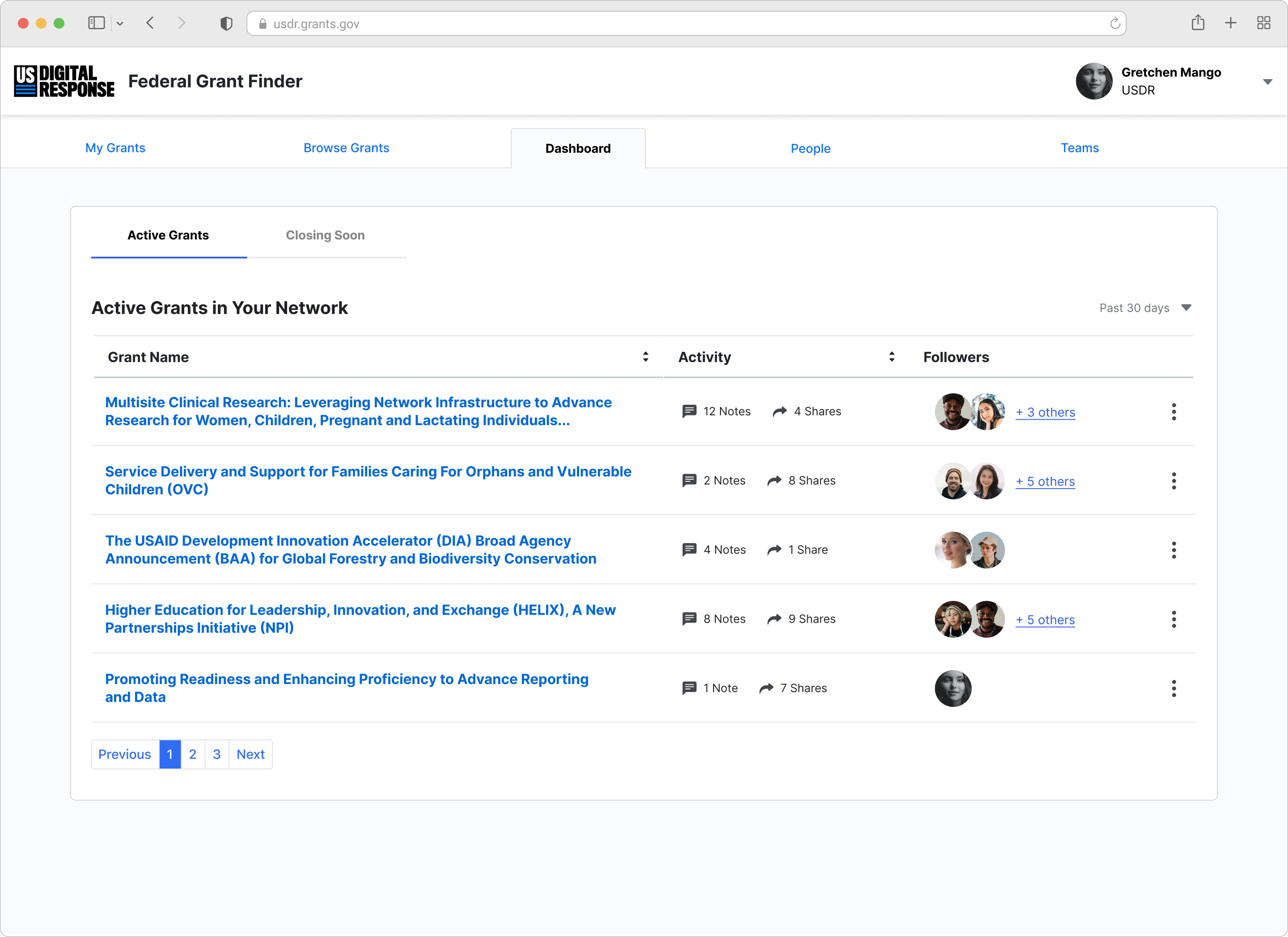
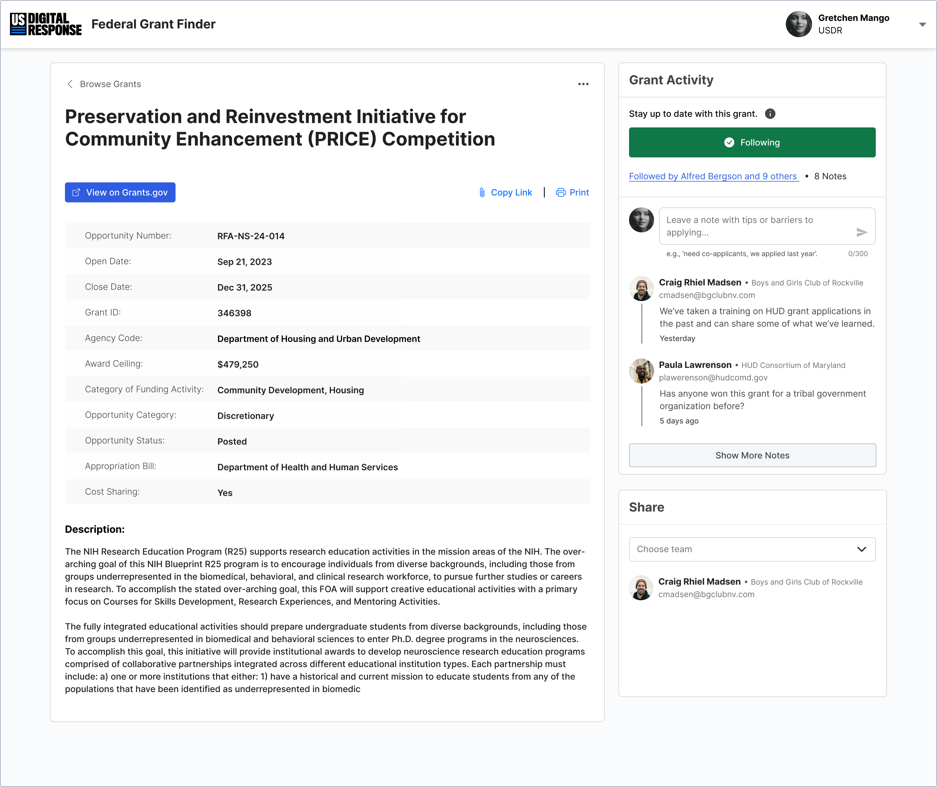
Giving Coordinators Visibility with a Smarter Dashboard
For coordinators, one of the biggest challenges was understanding network activity at a glance. We designed a dashboard that provided a real-time pulse on grant interest and team formation.
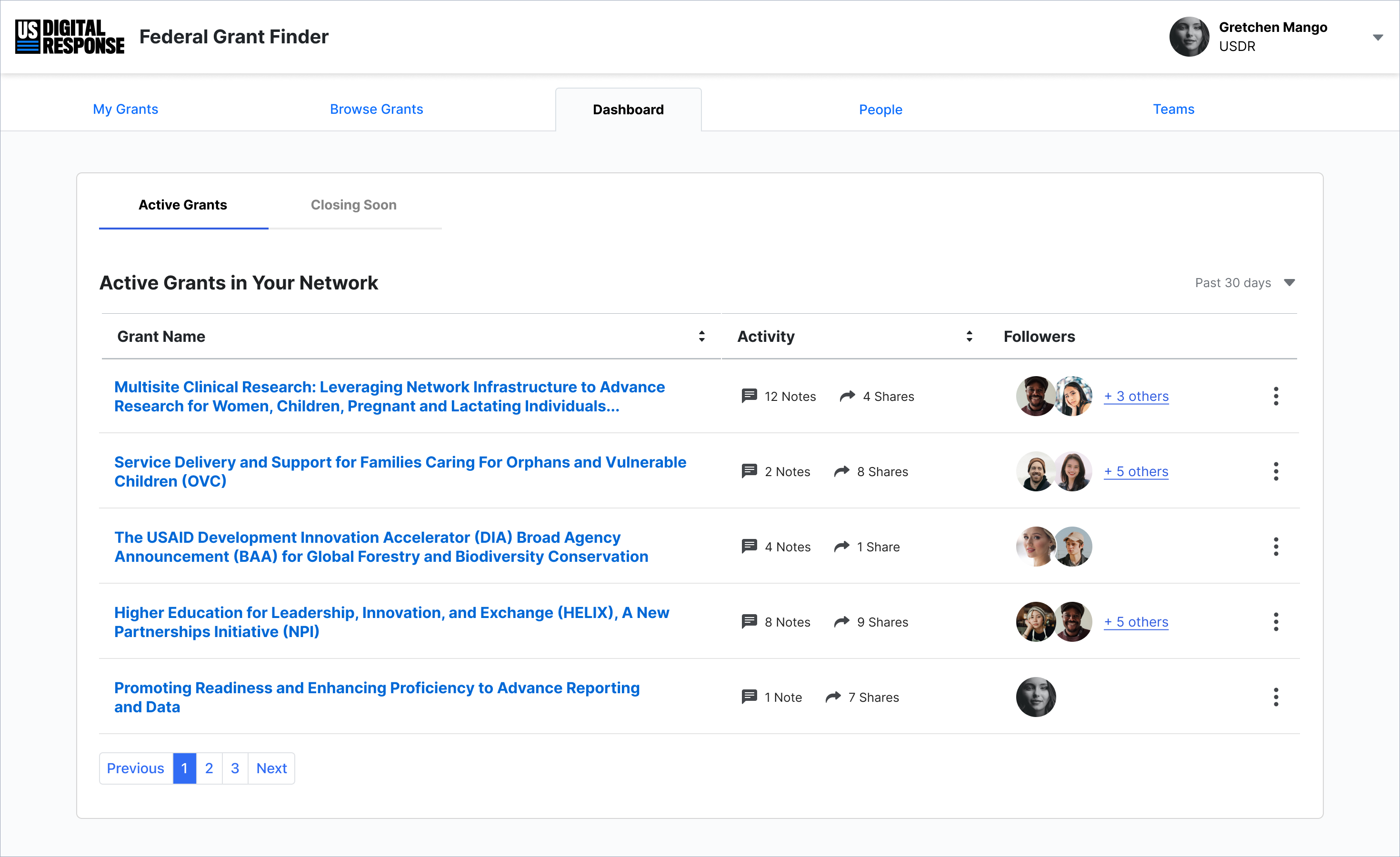
Fig. 13: Active Grants dashboard gives coordinators an overview of traction and activity across the network.
🔹 Active & popular grants: Helping coordinators spot trends and opportunities.
🔹 Applicant activity: Making it easy to review notes, requests, and potential partnerships.
🔹 Network engagement: Offering insights into platform-wide collaboration.
By tying people, visibility, and action together, these design changes transformed a static search tool into a dynamic collaboration engine—helping agencies not just find funding, but win it.
Outcomes
The Grant Finder Tool has transformed from a search tool into a collaborative platform, empowering agencies to leverage their networks, build stronger teams, and submit more competitive applications.
The result? A more connected, strategic, and effective approach to securing funding.
Ongoing testing with state networks in Maryland and Nevada, as well as regional coalitions, has received strong stakeholder support. Early data suggests these changes will increase access to funding opportunities and drive significant grant awards to communities.
01
Increased user engagement across the platform
• 3x increase in grant detail page views over six weeks.
• 70% conversion rate on shared grant emails to grant detail page.
• 82 notes left on 27 grants in the first six weeks after launch.
And across all projects, USDR maintains a 92 Net Promoter Score—evidence that partners don’t just use the tools, they champion them.
02
Stronger Market Differentiation
By fostering networking and collaboration, USDR has set a new standard in the federal grants space. Unlike traditional grant databases, Grant Finder actively supports partnership-building, solving a critical pain point for state and local governments navigating siloed processes.
03
Real Impact: More Funding for Communities
Qualitative and quantitative feedback confirms that stronger, more coordinated applications lead to more funding secured. As USDR continues refining the platform, this impact will scale, unlocking millions in grant awards for communities nationwide.
Reflections
This project marked a meaningful shift in my career—from designing high-security enterprise software to building public benefit SaaS tools. I’m proud of how our team navigated ambiguity with intention, using research and strategic alignment to carve out a niche opportunity in a crowded space. With a manager who modeled strong UX practices, I learned to balance clear goals with user and partner needs, shaping a UX strategy that guided both our feature vision and roadmap.
One challenge was adapting to a new development team and navigating handoffs in a partially defined design system. Style mismatches slowed implementation, so I improved our process by enhancing Figma specs, tightening documentation, and opening up more direct communication. I also gained a deeper appreciation for aiming before executing—prioritizing transparency and fit over simply building fast.
This experience sharpened my skills in strategy, collaboration, and thoughtful systems design—all while volunteering my time in civic tech. I’d bring that same energy, clarity, and cross-functional mindset to any team looking to turn complex problems into meaningful outcomes.

Thank you for reading!
If you want to hear more about this project, including how the USDR Federal Grant Finder Tool became the backbone of a new funding strategy in Nevada, reach out and let's chat!