UX DESIGN • ENTERPRISE SOFTWARE
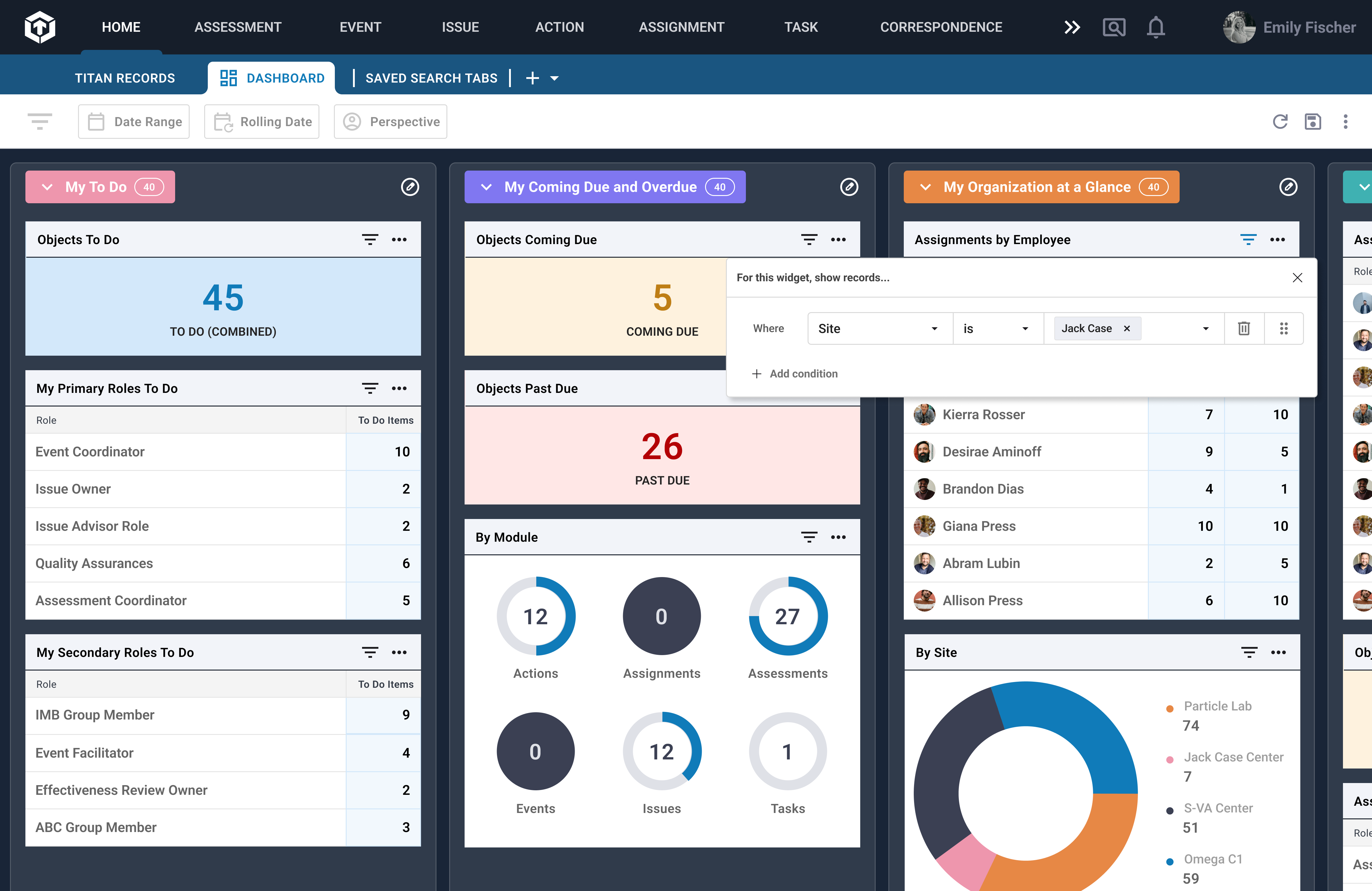
I designed a dashboard page for a scaling enterprise platform so users could easily see their project statuses, tasks, and team progress.
The new feature removed roadblocks to reporting and helped user prioritize and plan with their teams more efficiently.
Client
NNSA
March 2023 – October 2023
Contribution
- Lead UX/UI designer
- Design research
- Concept development and prototyping
- Developer hand-off
- Design System
Team
Shawn Ashmore (Engineering Manager)
Ken Lowery (Project Director)
Darla Self (Product Owner)
Aric Pair (UX Designer)
Design Process

Discovery
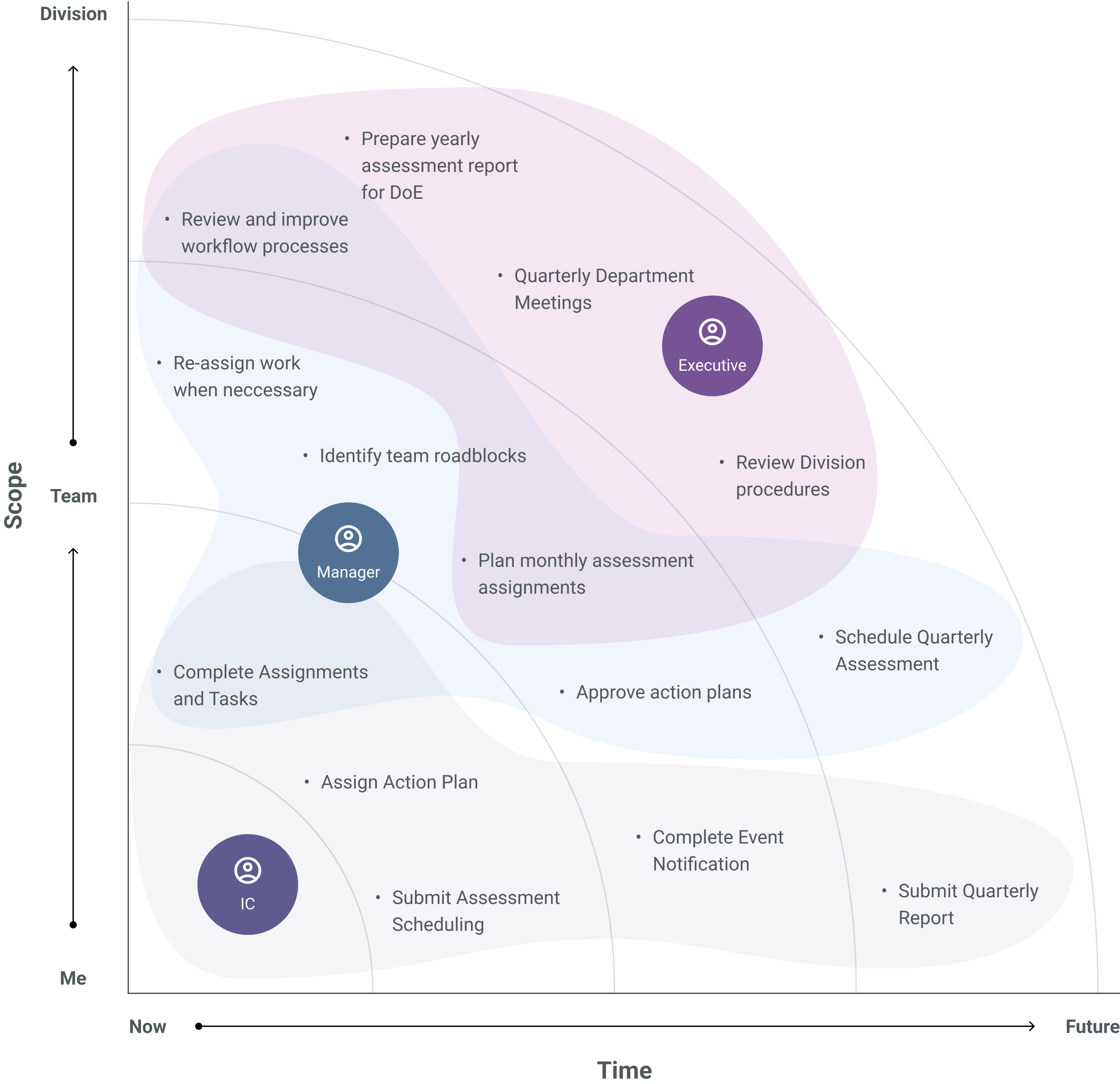
Fig. 01: As the Titan platform scales to include more workflow processes, users struggle to keep up with their tasks, their team's tasks, and other essential items requiring attention.
Problem
Titan consolidates multiple legacy applications into a single platform. As the platform scaled, users struggled to stay informed about ongoing workflows, upcoming deadlines, and team progress.
Users spent excess time navigating the platform’s modules to find their tasks and assignments or requested reports from managers—another timely process. Records would be submitted overdue due to roadblocks. Prioritization was time-consuming, inefficient, and siloed.
Stakeholder Interviews
To address this need, we spoke to managers, individual contributors, and the executive leadership team about priorities and information that help them make informed decisions.
This culminated in a set of general questions our solution would successfully answer:
1. What do I need to address right now?
2. What are my top priorities for the upcoming week, month, or quarter?
3. What are the forthcoming priorities for my organization?
Reporting of this nature was already done through Tableau, where manages would export progress reports on a weekly basis. An internal dashboard tool would allow all users to have a bird's-eye view on their work and their team's status.
Influence
Designs: First Pass
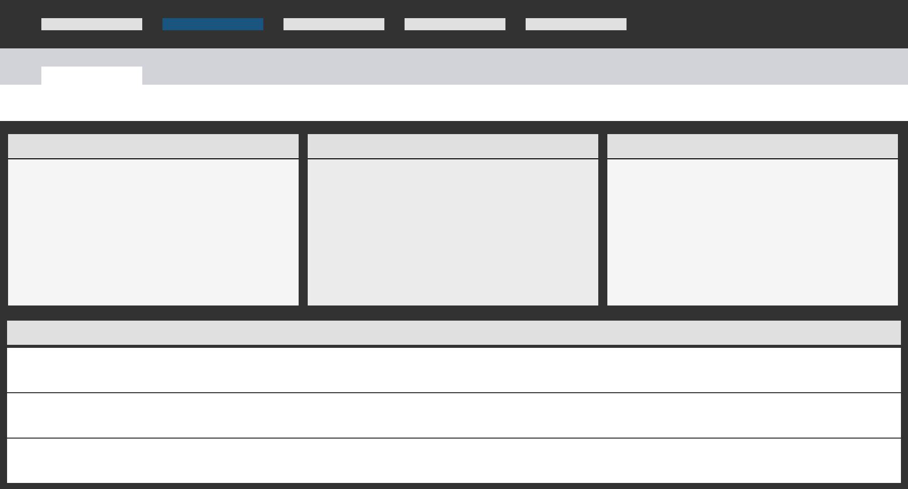
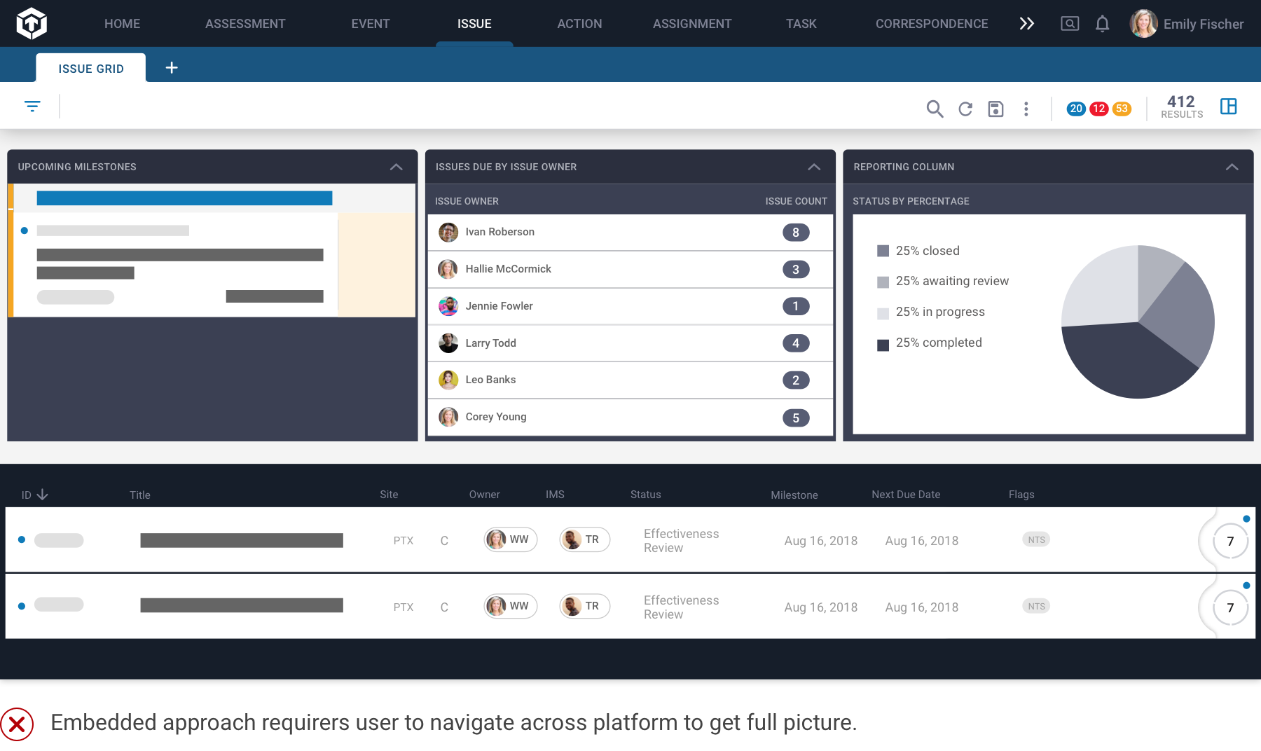
One of the first decisions we made when designing the dashboard feature was where to place it. We began with the hypothesis that embedding dashboard widgets within existing module grids would provide scannable information above a page.
Hypothesis: Embedding dashboard widgets into listing pages will provide contextual value to users who need to visualize workload.
Feedback: This solution required users to navigate across all modules to get a full picture of their tasks. A centralized dashboard would be better.
Designs: Second Pass
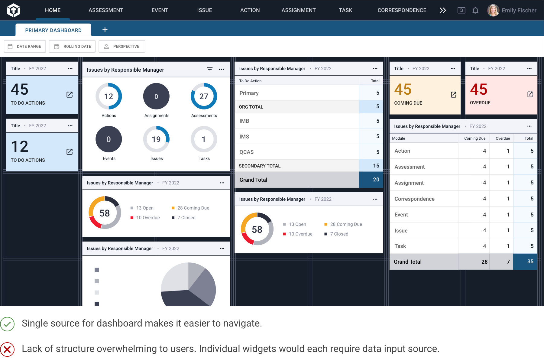
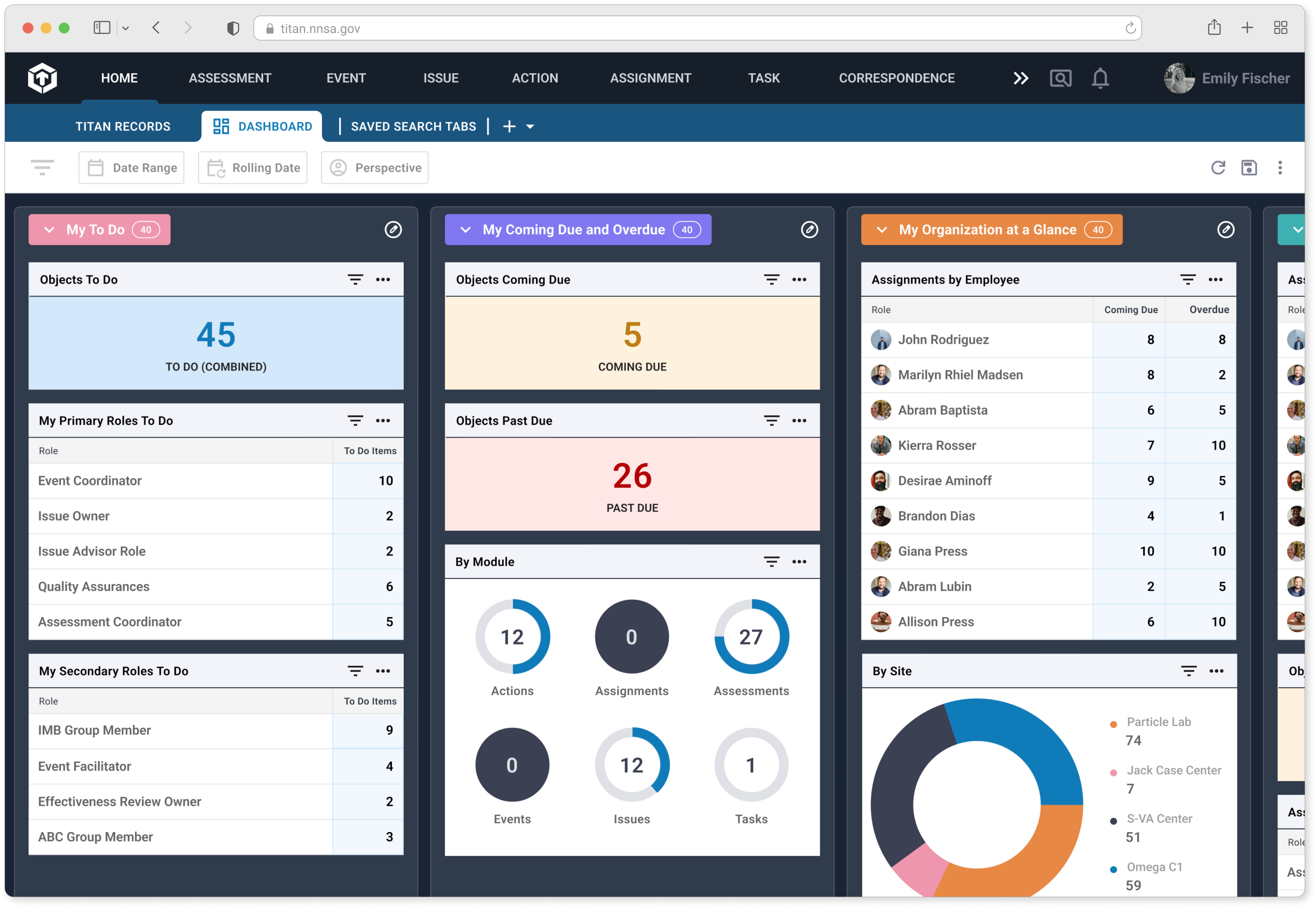
Hypothesis: Move the dashboard to a stand-alone page. Each widget is set up to pull in independent data.
Feedback: User feedback indicated a preference for a more structured layout with a clear information hierarchy.
Design and Prioritization Workshop
With a direction on where the dashboard would live, I still had unresolved questions on exactly how it would function. What specific information is most helpful to users? How would they interact with the visualizations? What should the dashboard lead to?
My team and I held a design brainstorming workshop to identify specific needs, create ownership of the dashboard's functionality, and prioritize the right features. I used a mix of question prompts and prioritization exercises to hone in on users' requirements and concerns moving forward.
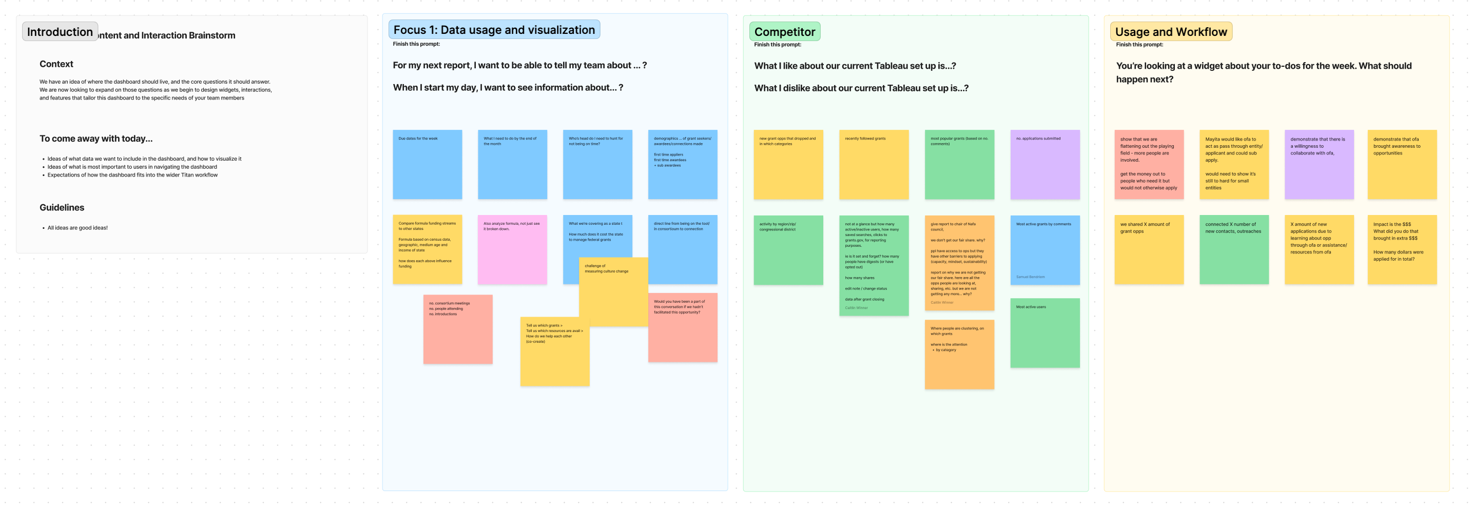
The core outcomes indicated that:
- Users wanted a single location to see their status on multiple modules and focus areas.
- Users enjoyed how Tableau included the records highlighted within visualizations.
- Users wanted to be able to share and export dashboard pages with their teams and managers.
North Star
The Titan Dashboard functions as the central location for facility employees and stakeholders to make informed decisions through interactive, customizable data visualization features.
01
A single source of information that needs to cover discrete datasets.
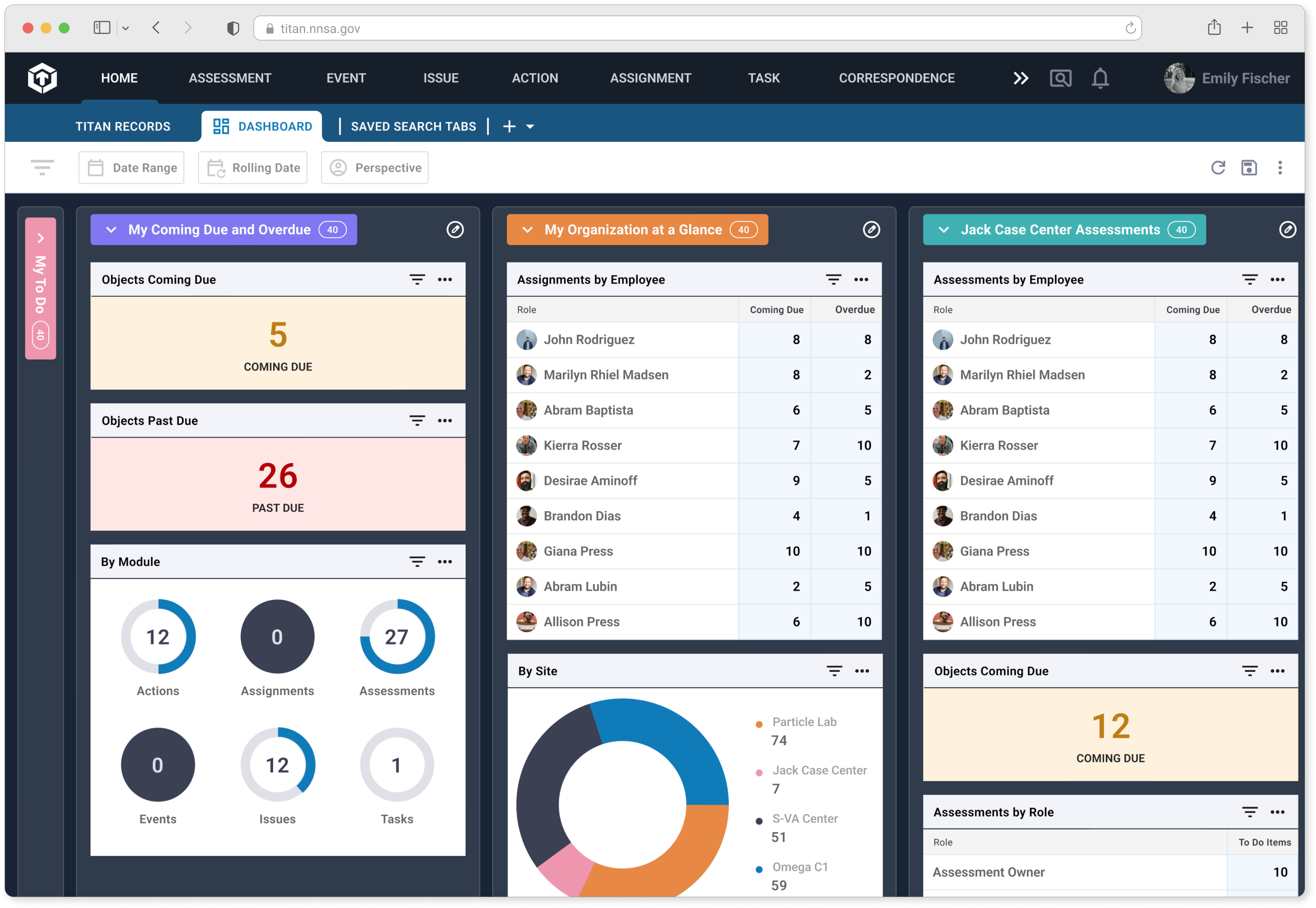
The Titan dashboard contains multiple discrete columns of datasets that can be customized to meet each user's needs and can be scanned horizontally.
02
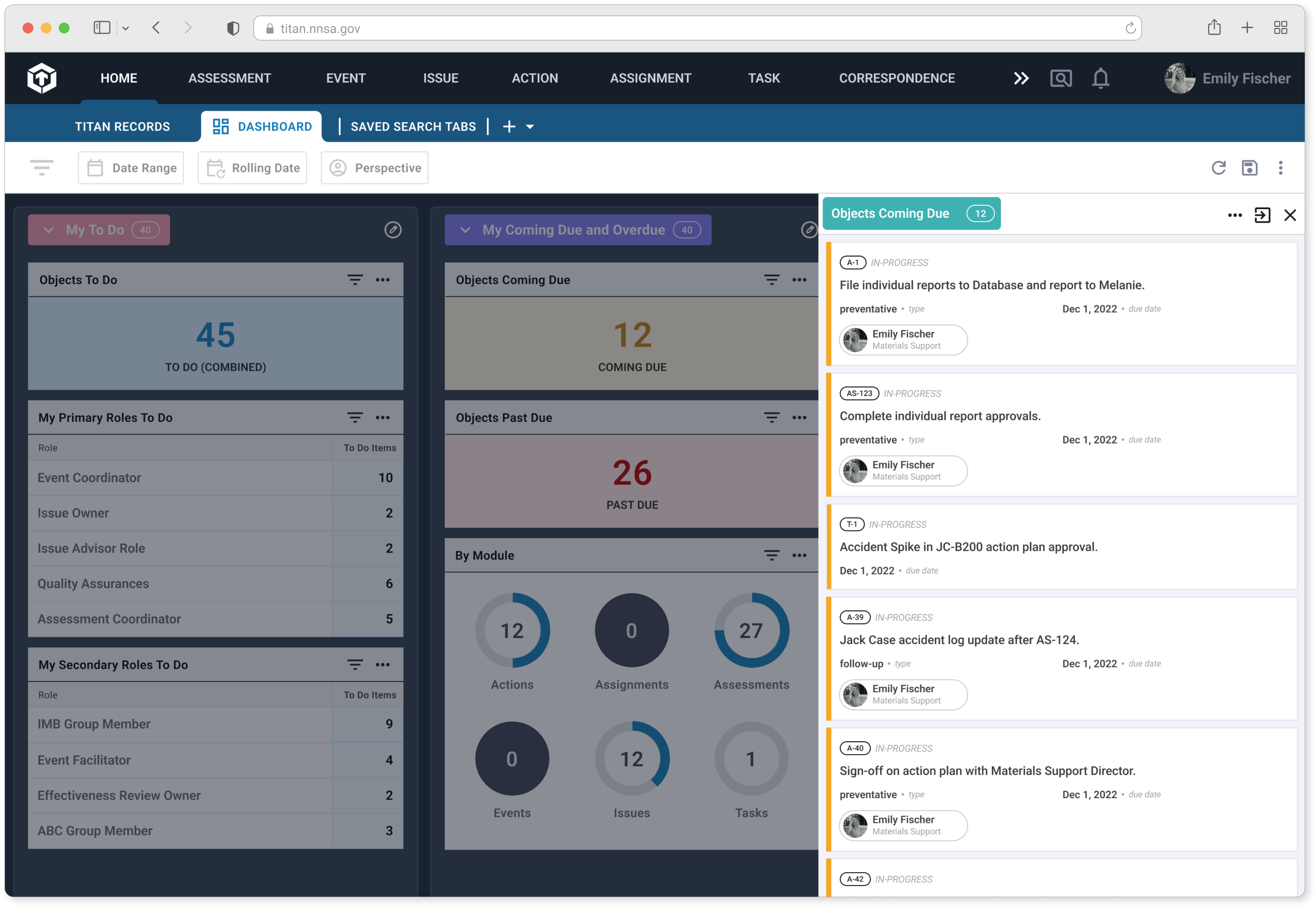
Each widget can be expanded to include record data.
Data visualizations open up preview panels with relevant records, streamlining the process from insight to action.
03
Share dashboard tabs like you would any other.
Each user can create, edit, and share their dashboards with team members, as well as export CSVs for further reporting uses.
Designs: Third Pass
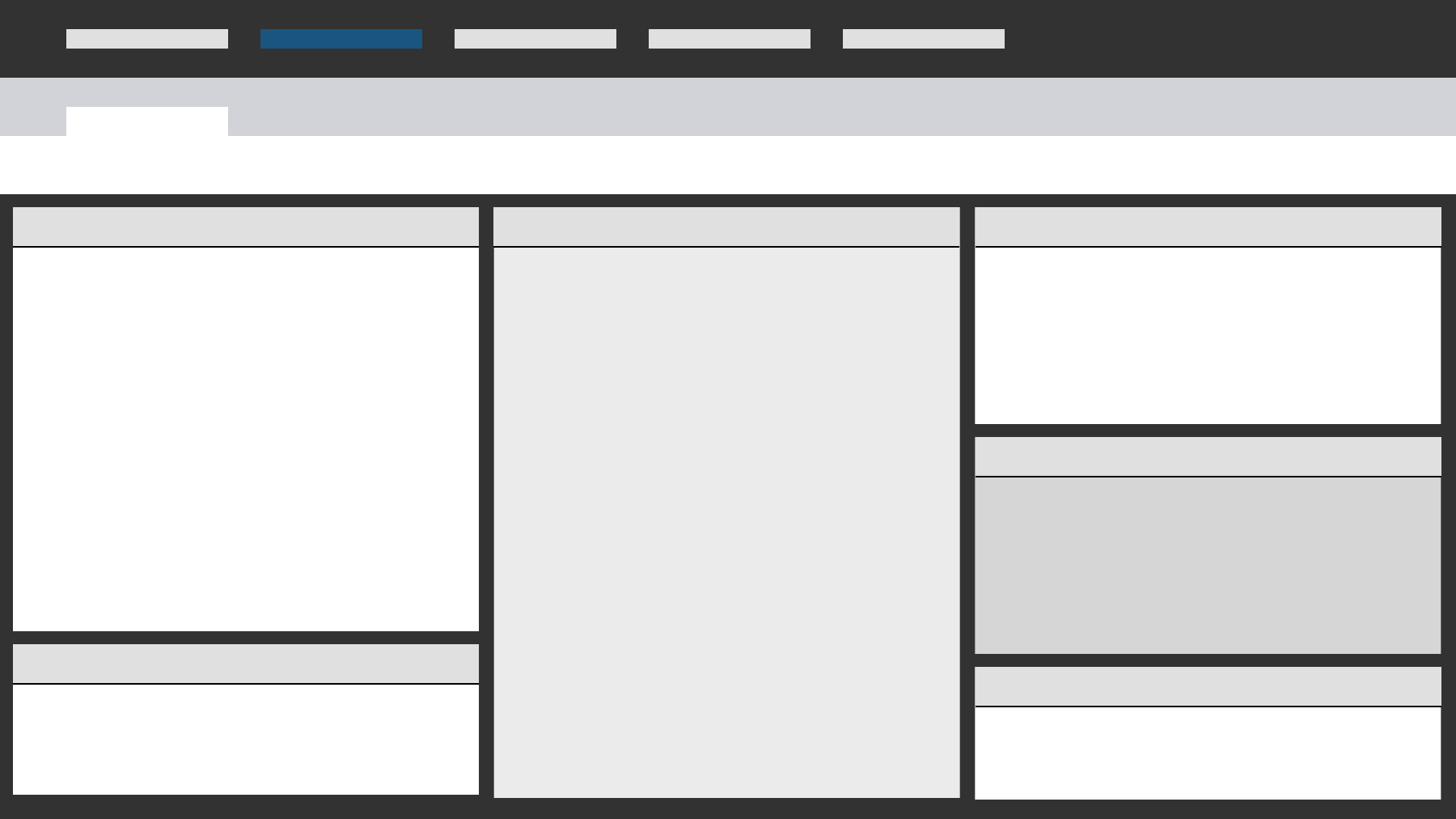
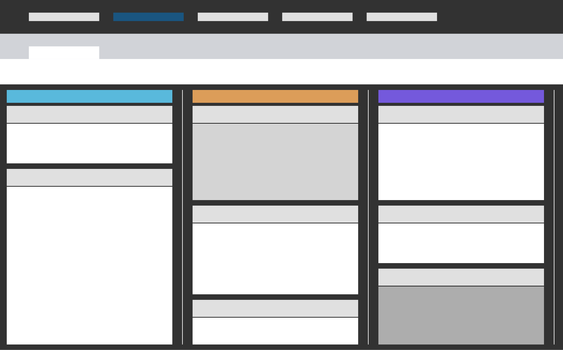
Hypothesis: A multi-column layout will balance a birds-eye view over multiple data streams with a more defined structure.
Feedback: This version was positively recieved to move forward with. It matched our goals of answering users' key questions and allowed future flexibility in adding new data streams and customizations.
Impact
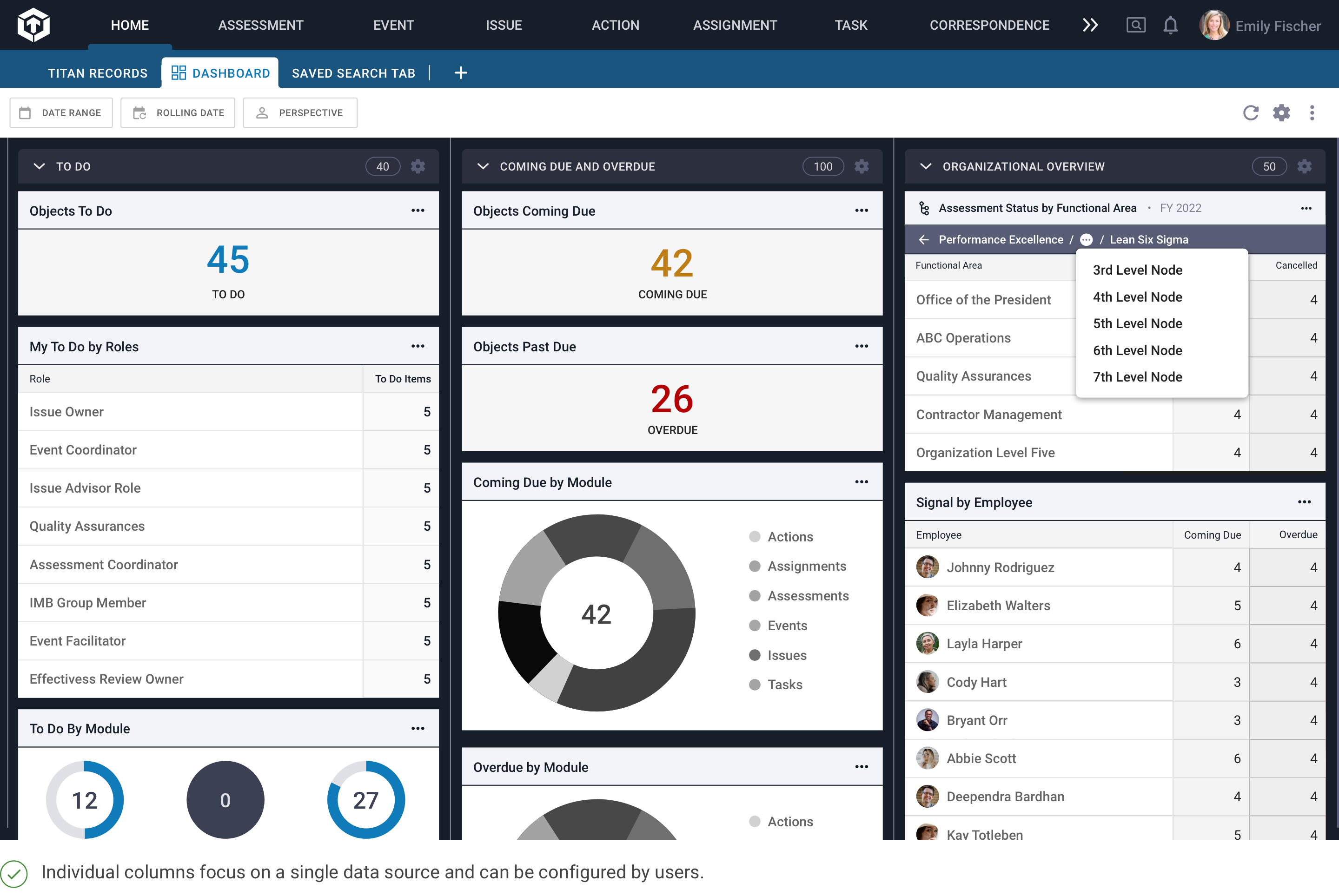
Fig. 02: Final dashboard showing a columned approach with the ability to view records included in each visualization.
Final Designs
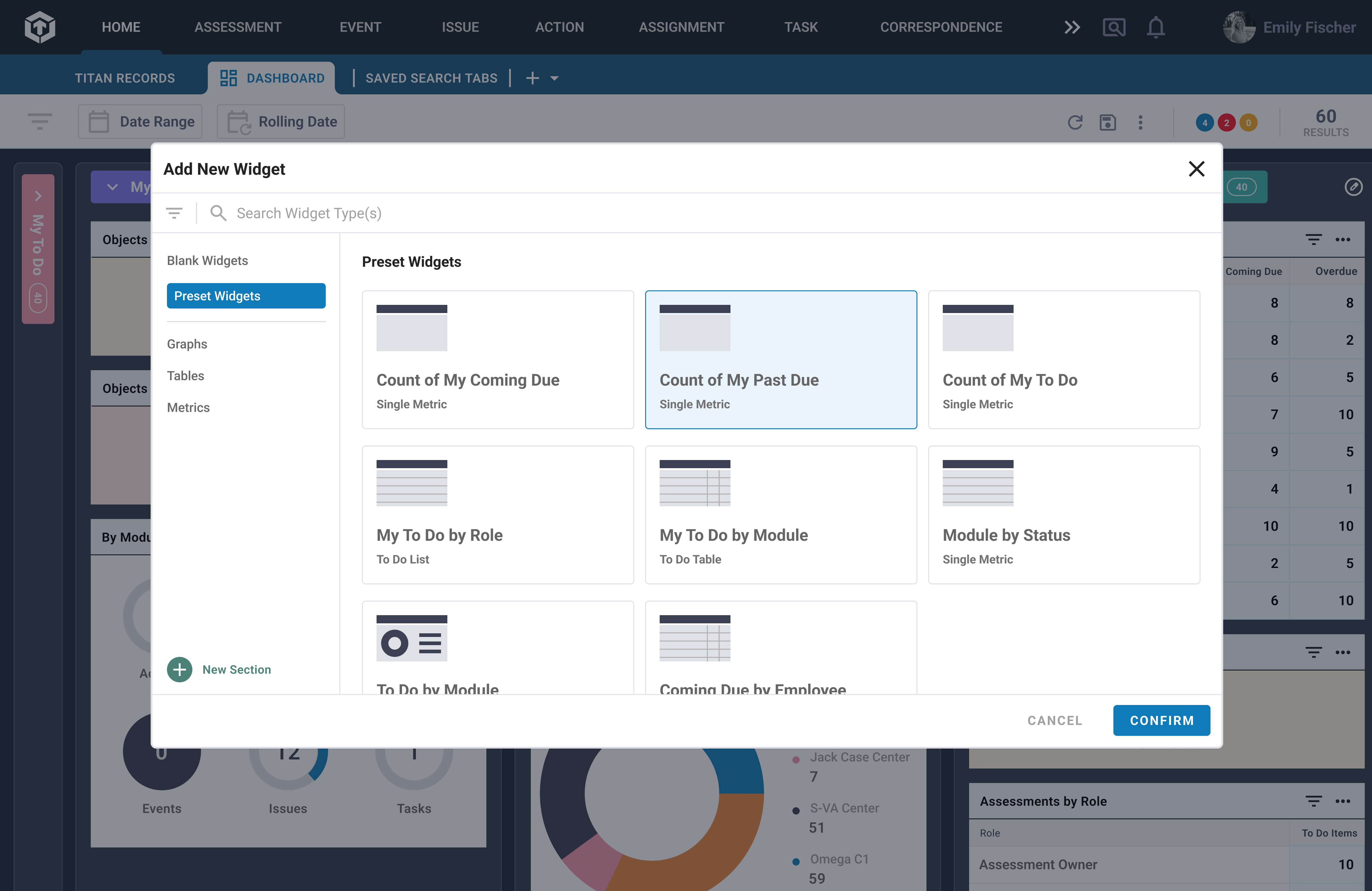
The outcome was a column-based dashboard where users could customize buckets of information to scan over without having to navigate away. I developed a set of components to scale up as more visualizations were needed.
The dashboard became a pivotal landing page for users to prioritize and plan their work.
A more informed and empowered user base.
The Titan Dashboard was launched with great enthusiasm at the end of October 2023. My team and I saw a steady adoption of the dashboard post release, as measured by page views and engagement. Moving away from Tableau and into the platform made it easier for new users to use dashboards as a landing page for their workflow.
We also saw users sharing and exporting dashboard pages. User testing would be needed to validate how well the dashboard is functioning, and to continue refining and expanding the available widget options.
The goal in improving the user experience was to empower users to make more informed decisions and advance the NNSA mission. Our release helped users prioritize their workload, be more aware of important information and available actions, as individuals and as teams.
Personally, I learned to trust the process and appreciate that each step forward brings more insights and improves the user experience. It was rewarding to find solutions that simplified the interface and provided a more elegant solution compared to previous iterations.
